 |
|
Latest News:
OOTP 26 Available
- FHM 11 Available
- OOTP Go! Available
Out of the Park Baseball 26 Buy Now! |

|
|
||||
| ||||
|
|||||||
| Talk Sports Discuss everything that is sports-related, like MLB, NFL, NHL, NBA, MLS, NASCAR, NCAA sports and teams, trades, coaches, bad calls etc. |
 |
|
|
Thread Tools |
 05-06-2025, 11:24 AM
|
#1 |
|
All Star Starter
Join Date: May 2015
Location: Hop, skip and a jump from Pomme De Terre Lake, MO.
Posts: 1,189
|
City Connect, City Connect, City Connect....
Just curious to your opinions....do you think this City Connect stuff is getting out of hand? I liked MLB's original version, but now a second uniform and the NBA doing it. I'm waiting for hockey and the NFL to dip their toes into the water.
|

|

|
|
05-06-2025, 12:10 PM
|
#2 |
|
Hall Of Famer
Join Date: Nov 2010
Location: Palmetto Pride!
Posts: 3,664
Infractions: 0/2 (2)
|
Like far too many viewers of Wall Street (1987), sports leagues have never understood that "Greed is Good" was sarcastic. (The screenwriter regretted putting the line in there.). They'll milk every dollar they can.
Do teams have the ability to opt out? I've noticed a significant lack of pink polka-dots or whatever on the Bronx Bombers. I don't know if that's deliberate or what. |
|
|
|
|
05-06-2025, 12:28 PM
|
#3 |
|
Hall Of Famer
Join Date: Jul 2015
Location: Parts unknown
Posts: 7,955
|
Do I like it? No. Getting out of hand? That expression comes w/ a connotation that some kind of damage is imminent. And I can't go that far. Those of us that are older might not like it for tradition's sake. But that is sentimentality. How is the customer hurt by having more options? We romanticize our past and childhood and sometimes we allow that to keep us stagnant and prevent potentially positive change.
I'm with u that it gets annoying to see. Some of these jerseys are hideous. And irritating when you see the RED Sox wearing yellow and the BLUE Jays in red.
__________________
If a man is guilty 4 what goes on inside of his mind, then let me get the electric chair 4 all my future crimes. - Prince Batdance June 7, 1958 - Apr 21, 2016 |
|
|
|
|
05-06-2025, 01:14 PM
|
#4 |
|
Hall Of Famer
Join Date: Nov 2010
Location: Palmetto Pride!
Posts: 3,664
Infractions: 0/2 (2)
|
If they want to sell rainbows in the stores, that's one thing. But a uniform should be a united form, building a unified image for the team through consistency. If you can't turn on the TV and know who's playing just by looking at the screen, that's not good, IMO. If Notre Dame sometimes swaps green for gold or if Clemson swaps orange for purple that's one thing; it's the same uniform with the complementary colors exchanged. When the Pirates had their "uniform of the day" in the "We are Family" era (21 possible combos) it was still all the same uniform, "black and yellow" to quote Wiz Khalifa*.
But silly designs (looking at you, San Francisco Fog) and random colors blow the whole point, I think. JMO. * Wiz Khalifa is not to be confused with Sammy Khalifa, the former shortstop for the Pirates.  Wiz may be the better hitter, but perhaps Sammy can actually sing, not just rap. Last edited by Amazin69; 05-06-2025 at 03:35 PM. |
|
|
|
|
05-06-2025, 01:18 PM
|
#5 |
|
Hall Of Famer
Join Date: Apr 2012
Location: Germany
Posts: 13,178
|
I loathe them. Get rid of them.
While you're busy disposing of things, ruining the sport, add the DH and Rob Numbfred, thanks.
__________________
Portland Raccoons, 90 years of excell-.... of baseball: Furballs here! 1983 * 1989 * 1991 * 1992 * 1993 * 1995 * 1996 * 2010 * 2017 * 2018 * 2019 * 2026 * 2028 * 2035 * 2037 * 2044 * 2045 * 2046 * 2047 * 2048 * 2051 * 2054 * 2055 * 2061 1 OSANAI : 2 POWELL : 7 NOMURA | RAMOS : 8 REECE : 10 BROWN : 15 HALL : 27 FERNANDEZ : 28 CASAS : 31 CARMONA : 32 WEST : 39 TONER : 46 SAITO Resident Mets Cynic - The Mets from 1962 onwards, here. |
|
|
|
|
05-06-2025, 01:38 PM
|
#6 |
|
Hall Of Famer
Join Date: Jul 2015
Location: Parts unknown
Posts: 7,955
|
And while we are on the subject of uniforms, let me take the chance to get this off my chest...............
The Yanks pinstripes are ugly. Yeah I said it. It is like every time the Yankees uniform is brought up a person is obligated to say how great and beautiful they are. They may be classics, but doesn't mean they look good. You know who wears classic clothing? British Beefeaters! Go to your cubicle wearing what they wear and see how long before HR would like to have a word. Guess who has been wearing the same thing since 1912 like the Yankees? The Amish! Anyone interested in raiding Sheamus' closet for fashion tips? Classic clothing just reps fashion people wore before they knew better. Old doesn't mean superior.
__________________
If a man is guilty 4 what goes on inside of his mind, then let me get the electric chair 4 all my future crimes. - Prince Batdance June 7, 1958 - Apr 21, 2016 |
|
|
|
|
05-06-2025, 07:16 PM
|
#7 | |
|
Hall Of Famer
Join Date: Apr 2009
Location: Long Island
Posts: 11,218
|
Quote:
 And I agree with "the RED Sox wearing yellow . . ." The other day, I caught one of their games with them in that uniform. The looked like canaries. I wanted to adjust the color setting on my TV screen but fortunately did not know how and was too lazy to find out.
__________________
- Bru |
|
|
|
|
|
05-06-2025, 08:43 PM
|
#8 |
|
All Star Starter
Join Date: May 2015
Location: Hop, skip and a jump from Pomme De Terre Lake, MO.
Posts: 1,189
|
If we go after uniforms as a whole, let me go after my Royals (or whoever changed the script logo). The classic Royals logo, the script with the swoosh thru the y was barely altered to where you wonder if it was worth it. The capital R was "skinnyed up" and the right leg of the R was brought out just a tad. The "thorn" at the left bottom of the o was removed and the swoosh is skinnier and shortened.
Really? Should've been left alone as it was. <<<<< Last edited by ForeverRoyalKC; 05-06-2025 at 08:51 PM. |
|
|
|
|
05-06-2025, 10:29 PM
|
#9 | |
|
Hall Of Famer
Join Date: Jul 2015
Location: Parts unknown
Posts: 7,955
|
Quote:
__________________
If a man is guilty 4 what goes on inside of his mind, then let me get the electric chair 4 all my future crimes. - Prince Batdance June 7, 1958 - Apr 21, 2016 |
|
|
|
|
|
05-06-2025, 11:36 PM
|
#10 |
|
All Star Starter
Join Date: Nov 2019
Posts: 1,108
|
To add to Cobra’s comment, it’s also easy money for the league, to sign a deal with the jersey designers. They get money to showcase a designers jerseys who in turn advertises their brand in order to get people to buy said jersey:
Hey! Commissioner! Leave those jerseys alone!
__________________
�Baseball isn�t statistics; it�s Joe DiMaggio rounding second.� �Once, centuries ago, it was the beloved national pastime of the Americas, Wesley. Abandoned by a society that prized fast food and faster games. Lost to impatience.� � The term �WAR� should be replaced by �WAG�. WAR isn�t an actual measurement; it�s just a wild-ass guess� -Bill James RIP National League 1876-2022 Floreat semper vel invita morte. I make custom ballparks. |
|
|
|
|
05-13-2025, 02:28 PM
|
#11 |
|
Hall Of Famer
Join Date: Aug 2002
Location: Large Province in God's Country
Posts: 7,907
|
I never got over the switch from home whites and away greys.
 Cap
__________________
"...There were Giants in Those Days.." |
|
|
|
|
05-13-2025, 04:09 PM
|
#12 |
|
Hall Of Famer
Join Date: Nov 2010
Location: Palmetto Pride!
Posts: 3,664
Infractions: 0/2 (2)
|
The Detroit Chitty Connects look fine…or they would on the Pistons. They've got no business mucking with the Olde English "D" to sell generic "Motor City" crap in its place. JMO.
|
|
|
|
|
06-14-2025, 07:55 PM
|
#13 |
|
Hall Of Famer
Join Date: Jan 2002
Posts: 6,417
|
Idk but the Boston uniforms look like slime vomit lemonade.
|
|
|
|
|
06-15-2025, 12:30 AM
|
#14 |
|
Hall Of Famer
Join Date: Nov 2010
Location: Palmetto Pride!
Posts: 3,664
Infractions: 0/2 (2)
|
I tuned to Yankees-Sox for a moment. Legit thought I'd hit the Little League WS, initially.
Well, I finally found a decent Chitty Connect uni…and my luck it's the ****ing Braves:  This is basically Atlanta's 1971-1974 uniform, the Hank Aaron Home Run Chase classics  The difference is that they swapped out the "Braves" for the "A" from the previous Braves kit, the 1967-1970 "Southern Yankees" look. And they chopped down the feather on the arm to make it more like a mountain, because we CAN'T evoke Native imagery! Mentioning that Natives exist (even in a state such as Georgia with serious history [Cherokee Confederation, then Trail of Tears]) is a big no-no guys! History is evil!! ") Oh, and they put a tiny "the" in front of "A", because Atlanta is one of those loser cities that thinks it's cool to stress that there are letters in their name, as if that's not every city anywhere. "The Chi", "The ATL"…so weak. The cities I lived in and around don't call themselves "The NY", "The Phi", "The LV" or "The LA", because they have actual reasons for people care about them. "the A". Oh, "F" off. But the uniforms are decent, which is a step above pretty much all the others out there. Last edited by Amazin69; 06-19-2025 at 12:40 PM. |
|
|
|
|
06-15-2025, 01:17 AM
|
#15 |
|
Hall Of Famer
Join Date: Jul 2015
Location: Parts unknown
Posts: 7,955
|
City Connect Jersey Power Rankings
I like a team to look like themselves. That largely influences my opinion.
THE UGLY Orioles  Plus At least they didn't try to incorporate the state flag somewhere like Maryland teams usually do. Minus Plain black and white w/trim from your mom's housecoat. NO. Reds  Plus The "C" logo on the cap is different. Minus You can't read the team name in front. Course, if I was wearing this, I wouldn't want anyone to know who I was either. Padres  Plus At least they kept the majority of the uniform white. Minus What are all these eye sore colors? Pink, some kind of green, and yellow? They look like they could cause epileptic seizures. I'm in the minority that likes San Diego's team colors. It is a disappointment when these uniforms are on the screen. Red Sox  Plus I get the Green Monster thing. So huge, I mean HUGE, baseball fan might dig the reference. Minus They are the color of the Green Monster. Do we really need to dress like it? And after all, these are the RED Sox. Rockies  Plus Logo ain't bad even though the colors are hideous. Minus Anyone know what they were going for here? Who was in the focus group that made the team green light these? They look like something Hollywood would design to imagine baseball on a Star Trek episode. Guardians  Plus They aren't see through. Minus I'd replace the "CLE" w/ "WHY". If this is all the imagination you can muster, why bother w/ doing it? I can't imagine these actually sell. White Sox /cdn.vox-cdn.com/uploads/chorus_asset/file/22546243/Yoa_n_Moncada_Lucas_Giolito_Tim_Anderson_City_Connect_Jerseys_2021.jpeg) Plus At least the colors match the regular team jerseys. Minus The gothic font brings to mind the Adams family. I'm expecting Gomez to be the manager. The BAD Nationals 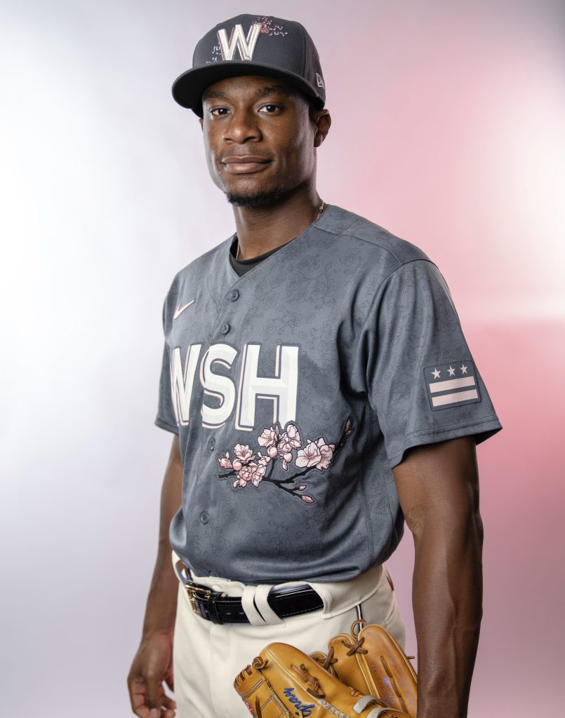 Plus Can't say they are ugly. Minus Lot of "meh" here. Cherry blossoms are too prominent & better suited as a smaller logo on the cap or a patch on the shoulder. Angels 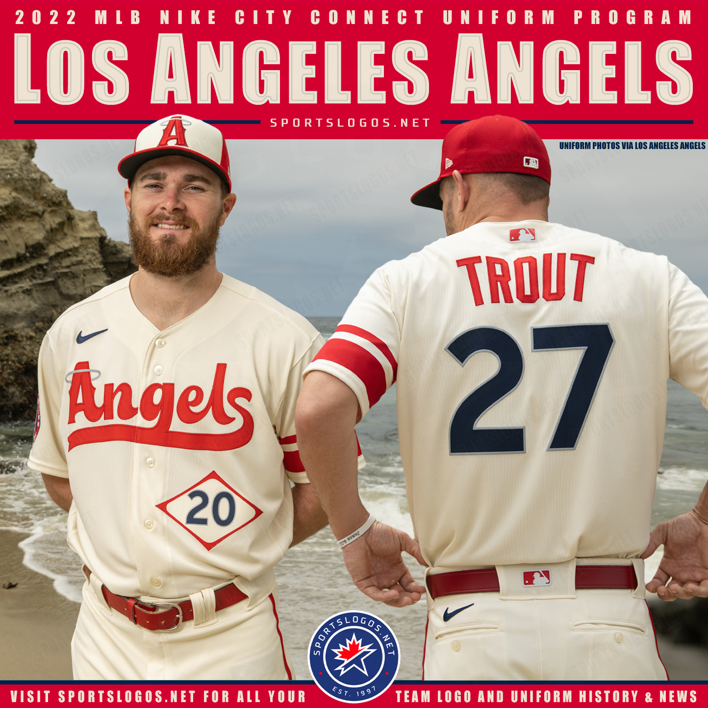 Plus Can't think of anything. If they were going for a 60's era expansion team look...success. Minus BORING. Barely looks like they tried. The jersey numbers inside the diamond looks like the placard info on an 18 wheeler. Rangers  Plus Looks like the designer of the Angels jersey at least tried to earn his pay on this one. Minus When I 1st saw these I thought a team from Japan was touring the USA. The black pants make the Rangers look like villains. Rockies 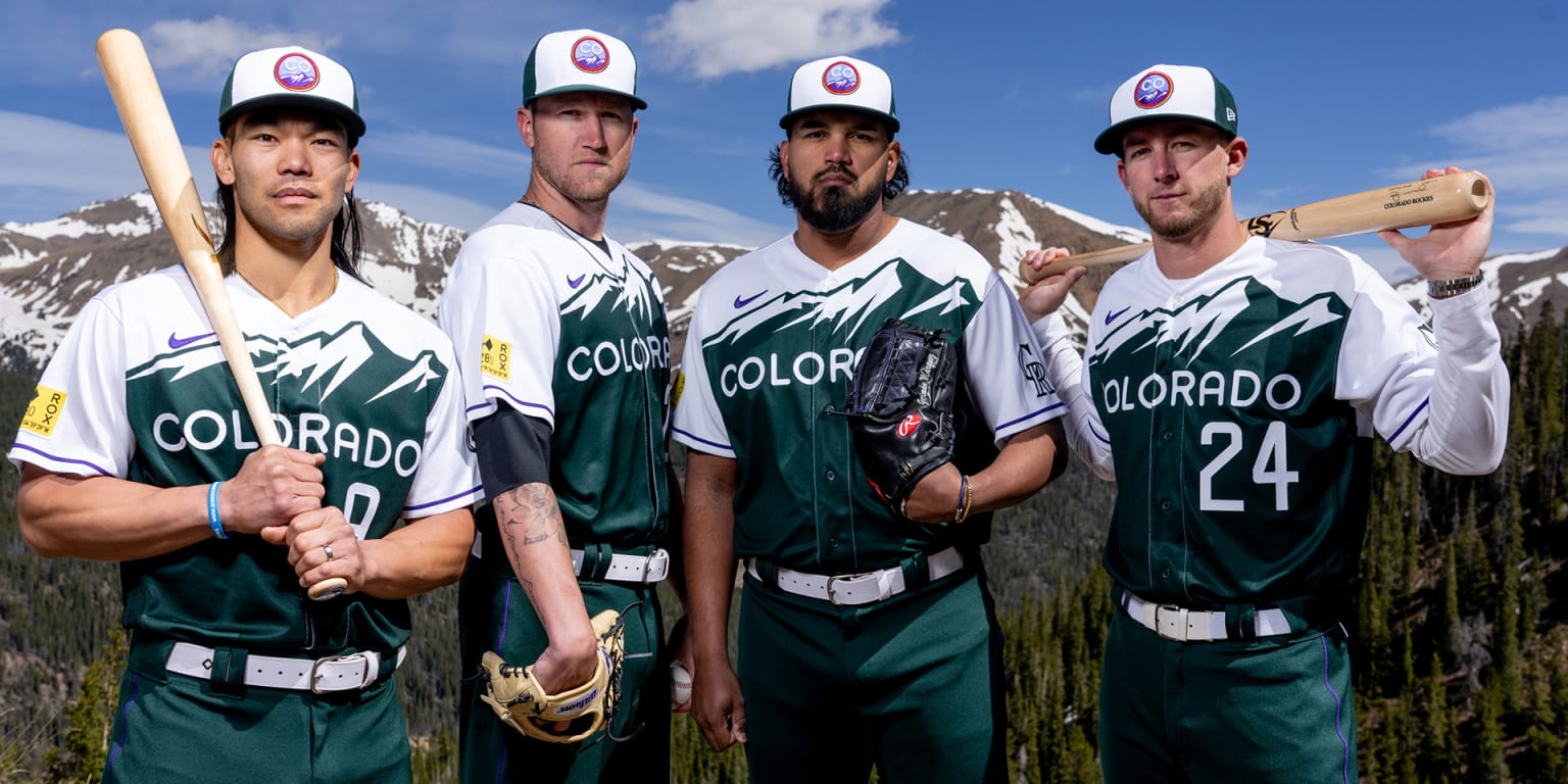 Plus A clean look. Creative w/o being too busy. Minus Despite the picture of the Rockies, does this look like THE Rockies? Diamondbacks 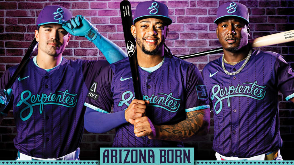 Plus The "S"/snake logo on the hat is nice. Minus How many frkkin' uniforms does Arizona frikkin' have? Enough is enough. They change costumes like Liberace. Mets Plus These would make good alternates for the Yankees. Minus These aren't the Yankees, these are the METS!!! Tell me you are jealous of your big brother w/o saying it. Marlins  Plus These aren't vomit-inducing but.......... Minus ......we've seen this before. Miami/Florida has had like 30 Miami Vice versions of their jerseys. It is like they are trying to distract us from the product on the field w/all their uniform changes. It doesn't say "this is special." Blue Jays  Plus Hey, look! Another black jersey! OK, that's not a plus. That's redundant. But I prefer these over the red shirts they wear on Canada Day. After all, they are the BLUE Jays! Minus From a distance, can you read the "Toronto" in front? How clear is the city skyline in the background from afar? If you aren't up close, the "city" looks more like a mistake at the print shop than a purposeful design. White Sox  Plus These actually don't look bad. Problem................ Minus I think Chicago Bulls when I see them, even though it is obviously a baseball uniform. Not the Pale Hose. Guess that is good for Reinsdorf, but is that good for baseball? Giants  Plus Again not ugly................. Minus Again, another black alternate. Script lettering makes me think I'm about to watch Saturday morning cartoons. Or a Korean game show w/zero English captions. Red Sox /cdn.vox-cdn.com/uploads/chorus_asset/file/25641792/2148601542.jpg) Plus IMO, these don't look bad. Minus What is the reason why we don't get the point of RED Sox? FLIPPIN' RED SOX??!!? You're calling attention to the discrepancy by putting 2 logos on the yellow socks. Brewers 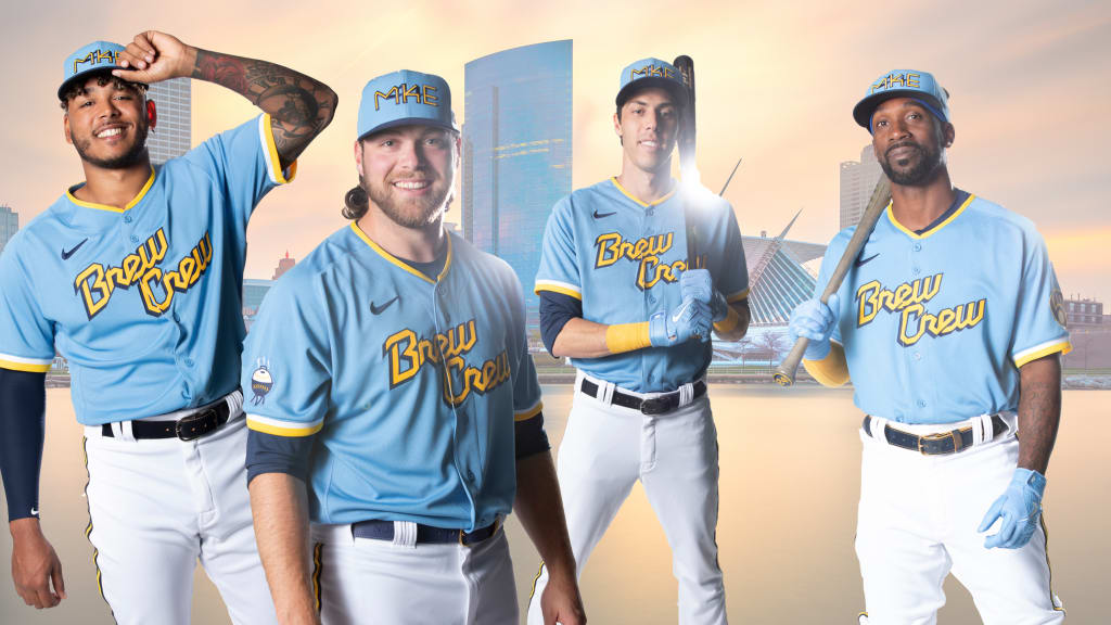 Plus Love the colors Minus "Brew Crew" makes them look like your local rec league softball team sponsored by the town's beverage distributorship. And I demand any Brewer cap have the best logo in sports no matter what. The GOODKeep in mind "good" is relative. Nationals  Plus Better than the "meh" originals. Better color, tiny cherry blossoms flanking the "W" w/the Capitol outline is nice detail and identifies the team. "DC" logo is less distracting than the huge "WSH". Minus The mosaic on the end of the sleeves is a detail I can do w/o. But at least it doesn't dominate the shirt. And the map of DC is unnecessary. Tigers  Plus I know, I know. More black jerseys. At least Detroit wears black on the regular, so they earn a pass. And I've always liked matching blue w/black. Minus What about this says "Tigers"? I think when you sell merchandise, you want to advertise your team. Wear this outside of Detroit and who is going to think of your franchise? Cubs  Plus I think these serve the team better than the Wrigleyville versions. The previous jersey is better for the locals. These are good for your national brand. Minus I'm too old. I think Expos when I see these. Phillies /cdn.vox-cdn.com/uploads/chorus_asset/file/25374335/city_connect_graphic_1.jpg) Plus I know traditionalists will hate these. But these grew on me. Minus The "Philly" font is hideous. Better suited for a horror movie poster. Ruins the look. But Philadelphia is an ugly city to me. So maybe it fits. Dodgers  Plus Different w/o going too crazy. You still feel like you are watching the Dodgers. Minus Not "finishing" the numbers on the back keeps this a double & not a homer. And what up wit dem socks? Braves Plus Brings back fond memories of Hank Aaron, Dale Murphy & Bob Horner. New and somehow classic at the same time. Minus Isn't it "the ATL", not "the A"? A detail that wasn't needed & doesn't work. Royals  Plus You probably can tell blue is my fave color. Minus Logo looks like a tangle of paper clips. Jersey loses a lot if the light blue long sleeve isn't worn underneath. Pirates 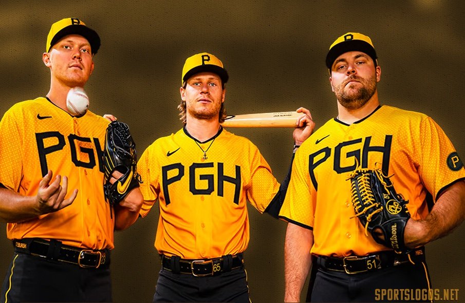 Plus I've heard a lot of criticism for this one. I couldn't disagree more. These are great!! Minus The "PGH". Do people think "Pittsburgh" when they see those letters? Need something else up front. (Can someone tell me what happened to the bat in the above pic?) Mariners /cdn.vox-cdn.com/uploads/chorus_image/image/72852349/1689520281.0.jpg) Plus Like the Braves, these manage to be new. Yet still appear vintage. Minus The black pants are a mismatch. When the whole thing is put together, it looks like someone dressed in the dark or skipped laundry day. Astros 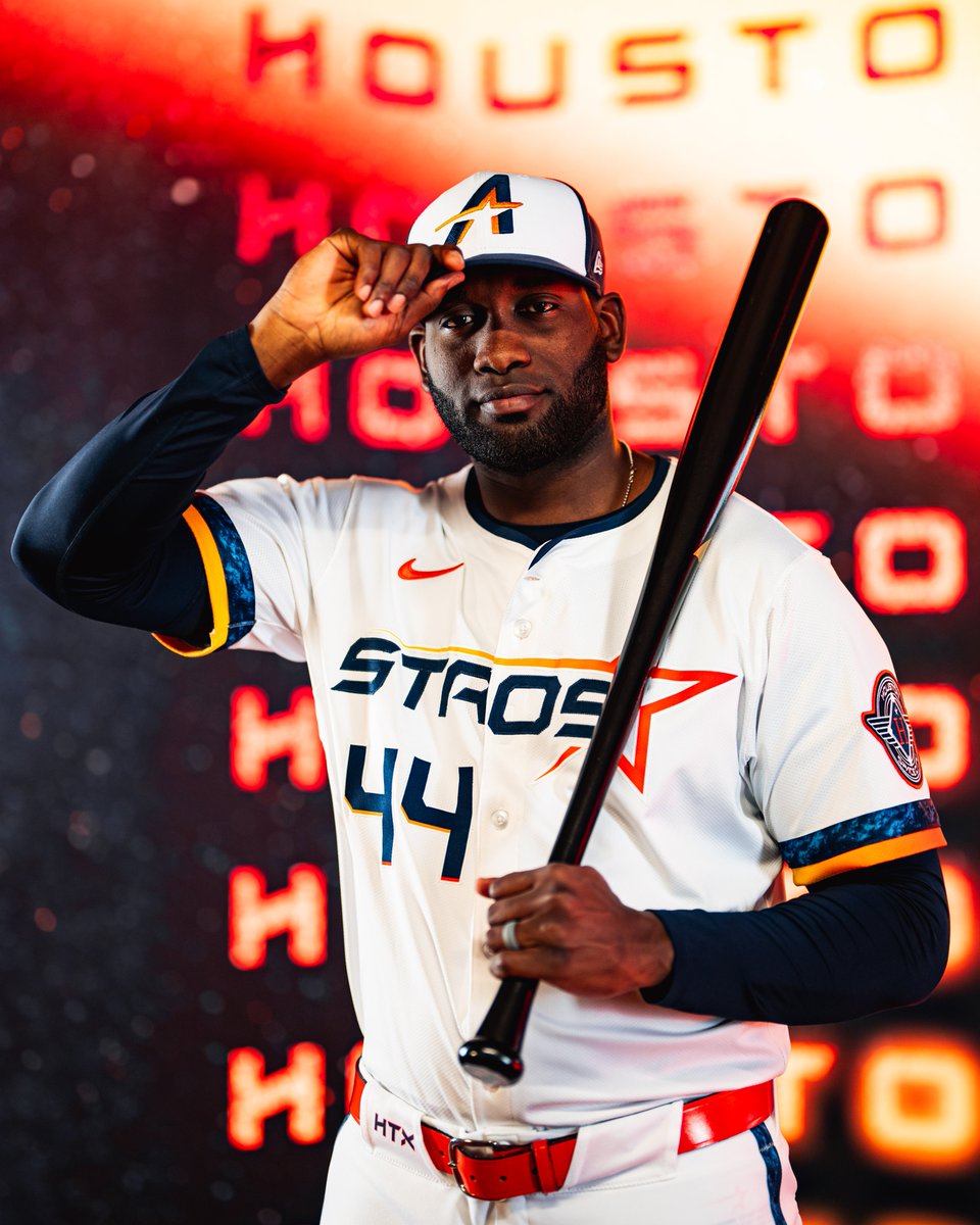 Plus These need to be the regular threads yesterday. Homage to the rainbow jerseys w/out looking cheesy or gaudy. Minus Nothing. The font, logo on the cap, design, numbers to the right, the "story"......Everything works. Send that "Space City" shirt up in the next rocket. Cardinals Plus They knew the assignment. They "connected" to the city. And they still look like the Cards. Work is done. Minus If I want to nitpick, the "STL" on the cap is too plain. Otherwise, no major mistakes here.
__________________
If a man is guilty 4 what goes on inside of his mind, then let me get the electric chair 4 all my future crimes. - Prince Batdance June 7, 1958 - Apr 21, 2016 |
|
|
|
|
06-18-2025, 04:59 PM
|
#16 | |
|
Hall Of Famer
Join Date: May 2004
Posts: 10,605
|
I feel like for a lot of these they don’t necessarily need to look snappy to people outside of the city or fan base. I have to admit that I think the original Marlins CCs are very in keeping with the vibes of the city and I like them the same way I like the 80s Astros or creamsicle Buccaneers unis. My biggest issue with the White Sox is that Reinsdorf won’t model any of them after their 80s unis which to me are iconic. The Bulls ones are… fine.
Ironically one of the best CCs I’ve seen in any sport were the ones the Bulls did a couple seasons ago that they modeled after the Carbon and Carbide Building. It’s here, the one from 2020: https://images.app.goo.gl/6p3dKo4WgyCBPYBL6 The 2018 model is also tight; I don’t think any other city in the US displays their flag as loudly and proudly as Chicago does (can you even visualize another city’s flag?).
__________________
Quote:
|
|
|
|
|
|
06-18-2025, 07:14 PM
|
#17 | |
|
Hall Of Famer
Join Date: Jul 2015
Location: Parts unknown
Posts: 7,955
|
Quote:
__________________
If a man is guilty 4 what goes on inside of his mind, then let me get the electric chair 4 all my future crimes. - Prince Batdance June 7, 1958 - Apr 21, 2016 |
|
|
|
|
|
06-19-2025, 04:32 AM
|
#18 | |
|
Hall Of Famer
Join Date: Apr 2012
Location: Germany
Posts: 13,178
|
Quote:

__________________
Portland Raccoons, 90 years of excell-.... of baseball: Furballs here! 1983 * 1989 * 1991 * 1992 * 1993 * 1995 * 1996 * 2010 * 2017 * 2018 * 2019 * 2026 * 2028 * 2035 * 2037 * 2044 * 2045 * 2046 * 2047 * 2048 * 2051 * 2054 * 2055 * 2061 1 OSANAI : 2 POWELL : 7 NOMURA | RAMOS : 8 REECE : 10 BROWN : 15 HALL : 27 FERNANDEZ : 28 CASAS : 31 CARMONA : 32 WEST : 39 TONER : 46 SAITO Resident Mets Cynic - The Mets from 1962 onwards, here. |
|
|
|
|
|
| Bookmarks |
|
|


