|
|
Latest News:
OOTP 27 Buy Now
- FHM 12 Available
- OOTP Go! 27 Available
Out of the Park Baseball 27 Buy Now! |

|
|
||||
| ||||
 08-10-2012, 01:38 PM
|
#1 |
|
Hall Of Famer
Join Date: Jun 2002
Location: Canuckistan
Posts: 5,162
|
Request; Jerseys, caps, and logos for the WLB!
I found an old OOTP4 league file which was founded in 2002 (real life) and imported it all the way up to OOTP 13 and would love to rerun this league. I am looking for your help in creating the league logo, jerseys, and team logos for it.
The teams are as follows:  Please and thanks! I will gladly share the quickstart once it is finished! |

|

|
|
08-10-2012, 01:45 PM
|
#2 |
|
Hall Of Famer
Join Date: Jun 2002
Location: Canuckistan
Posts: 5,162
|
I have the following logos already created:
  
|
|
|
|
|
08-13-2012, 11:24 AM
|
#3 |
|
Hall Of Famer
Join Date: Jun 2002
Location: Canuckistan
Posts: 5,162
|
bump
|
|
|
|
|
08-26-2012, 12:43 PM
|
#4 |
|
Hall Of Famer
Join Date: Jun 2002
Location: Canuckistan
Posts: 5,162
|
bump
|
|
|
|
|
08-26-2012, 05:01 PM
|
#5 |
|
Minors (Triple A)
Join Date: Oct 2011
Posts: 224
|
Made this for ya changed the name though World League Baseball sound weird.....
 
Last edited by Ky55Marine; 08-26-2012 at 05:40 PM. |
|
|
|
|
08-27-2012, 08:14 AM
|
#6 | |
|
Hall Of Famer
Join Date: Jun 2002
Location: Canuckistan
Posts: 5,162
|
Quote:
|
|
|
|
|
|
08-28-2012, 10:15 PM
|
#7 |
|
Hall Of Famer
Join Date: Jun 2002
Location: Canuckistan
Posts: 5,162
|
Still looking for jerseys caps and team logos :-)
please and thanks! |
|
|
|
|
08-28-2012, 10:16 PM
|
#8 | |
|
Hall Of Famer
Join Date: Jun 2002
Location: Canuckistan
Posts: 5,162
|
Quote:
|
|
|
|
|
|
09-21-2012, 09:08 PM
|
#9 |
|
Hall Of Famer
Join Date: Jun 2002
Location: Canuckistan
Posts: 5,162
|
bump, please help :-(
|
|
|
|
|
09-22-2012, 06:17 AM
|
#10 |
|
Hall Of Famer
Join Date: Apr 2003
Posts: 3,347
|
I probably won't be able to get to all of these by myself, but I'll try to get to as many as possible.

|
|
|
|
|
09-22-2012, 08:35 PM
|
#11 |
|
All Star Starter
Join Date: Jul 2002
Posts: 1,725
|
You are red hot with this 'retro' look. My favorite look to use has always been a silhouette of something as it helps present a clean logo...which is what you are hitting a home run on, knuck. Very clean design. I'll try and help out as I can as it looks like RBLwebguy has been waiting awhile in hopes of someone filling out his request.
Cape Town Lions--Although I may end up thinking this is too busy but I'll make up a jersey and get a look at it in-game. dark brown: 64300a med brown: 874b21 light brown: c38e63  
Last edited by truthserum; 09-22-2012 at 09:37 PM. |
|
|
|
|
09-22-2012, 08:50 PM
|
#12 |
|
Hall Of Famer
Join Date: Jun 2002
Location: Canuckistan
Posts: 5,162
|
I love these logos!
|
|
|
|
|
09-22-2012, 09:28 PM
|
#13 |
|
All Star Starter
Join Date: Jul 2002
Posts: 1,725
|
The logo didn't look too busy....
  Here's a jersey for it, with a couple of cap options.  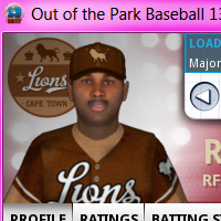 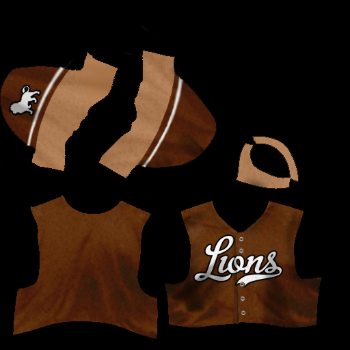  
Last edited by truthserum; 09-22-2012 at 09:38 PM. |
|
|
|
|
09-22-2012, 09:29 PM
|
#14 |
|
Hall Of Famer
Join Date: Jun 2002
Location: Canuckistan
Posts: 5,162
|
Awesome!
|
|
|
|
|
09-22-2012, 09:39 PM
|
#15 |
|
All Star Starter
Join Date: Jul 2002
Posts: 1,725
|
Guess what....you got fast response!!
 You respond before I can edit my posts!! Added a logo option with white stars that might be better. You respond before I can edit my posts!! Added a logo option with white stars that might be better.
|
|
|
|
|
09-22-2012, 09:43 PM
|
#16 |
|
Hall Of Famer
Join Date: Jun 2002
Location: Canuckistan
Posts: 5,162
|
Yeah I like the white stars better, and I am fast on the draw tonight :-)
|
|
|
|
|
09-23-2012, 12:47 AM
|
#17 | |
|
Minors (Triple A)
Join Date: Oct 2011
Posts: 224
|
Quote:
|
|
|
|
|
|
09-23-2012, 07:00 AM
|
#18 |
|
Hall Of Famer
Join Date: Apr 2003
Posts: 3,347
|
I really like the Lions set - the colors are great and the crowns are a nice touch. Thanks for the kind words, too. I'm not too crazy about the Conquistadors one, but it's tough when the name is so long, you really have to find the right font.
|
|
|
|
|
09-23-2012, 09:53 AM
|
#19 |
|
Hall Of Famer
Join Date: Apr 2003
Posts: 3,347
|

Last edited by knuckler; 09-23-2012 at 10:05 AM. |
|
|
|
|
09-23-2012, 10:14 AM
|
#20 | |
|
All Star Starter
Join Date: Jul 2002
Posts: 1,725
|
Quote:
Last edited by truthserum; 09-23-2012 at 10:15 AM. |
|
|
|
|
 |
| Bookmarks |
|
|