 |
|
Latest News:
OOTP 27 Buy Now
- FHM 12 Available
- OOTP Go! 27 Available
Out of the Park Baseball 27 Buy Now! |

|
|
||||
| ||||
 12-18-2012, 11:42 PM
|
#1 |
|
Hall Of Famer
Join Date: Aug 2011
Location: Tampa Bay, Massachusetts
Posts: 2,928
|
Updated CCBL Uniforms
I was planning on starting a new game based in one of my favorite Summer Leagues, the Cape Cod Baseball League. However, I've discovered that the CCBL uniforms on OOTPMODS are out of date. In 2008, a few teams changed their names/logos after the MLB enforced its trademark and required teams that shared a name with MLB teams to either change their names or buy their uniforms through licensed vendors. So, I figured I'd get cracking on some updated uniforms. I'll be doing home, away, and alternates for all 10 teams.
Anyone is free to use these if they wish. Last edited by Fyrestorm3; 12-18-2012 at 11:45 PM. |

|

|
|
12-18-2012, 11:45 PM
|
#2 |
|
Hall Of Famer
Join Date: Aug 2011
Location: Tampa Bay, Massachusetts
Posts: 2,928
|
First up, my boys the Chatham Anglers.
Logo:  Cap: 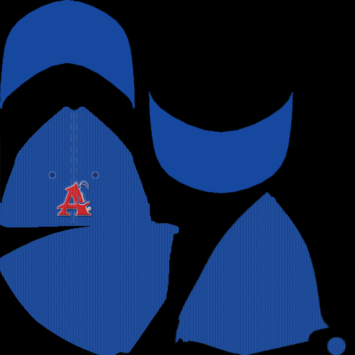 Home: 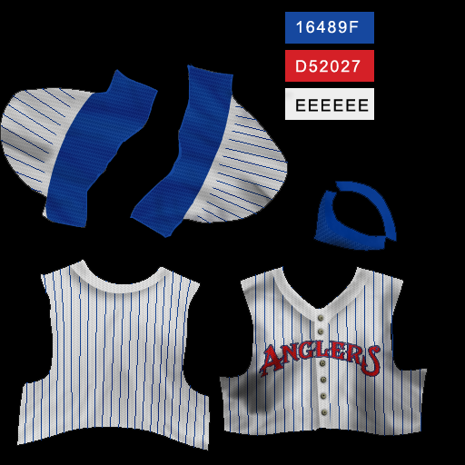  Away: 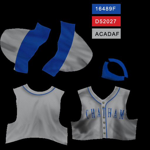  Alternate: 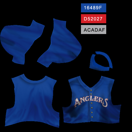 
Last edited by Fyrestorm3; 12-19-2012 at 01:29 AM. |
|
|
|
|
12-19-2012, 01:26 AM
|
#3 |
|
Hall Of Famer
Join Date: Aug 2011
Location: Tampa Bay, Massachusetts
Posts: 2,928
|
Bourne Braves
Logo:  Cap:  Home: 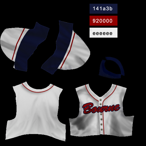  Away:   Alternate:   NOTE: The away jersey is not a perfect recreation, but I'm not good enough with this stuff to do a full custom that I don't have a template for. I came close, though. |
|
|
|
|
12-19-2012, 02:50 PM
|
#4 |
|
Hall Of Famer
Join Date: Aug 2011
Location: Tampa Bay, Massachusetts
Posts: 2,928
|
The Yarmouth-Dennis Red Sox:
Logo:  Cap (home and away):   Home: 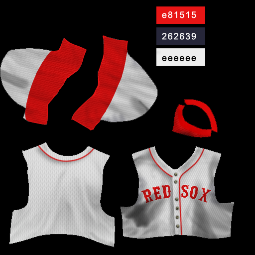  Away:   Alternate:  
Last edited by Fyrestorm3; 12-19-2012 at 04:18 PM. |
|
|
|
|
12-19-2012, 08:53 PM
|
#5 |
|
Hall Of Famer
Join Date: Aug 2011
Location: Tampa Bay, Massachusetts
Posts: 2,928
|
For the Wareham Gatemen, I took a little bit of a liberty with their color scheme. They're actually red and very dark blue, and I was having a hard time getting the blue right. However, it's so dark that it tends to look black, so I decided to simply go with black for this template.
Logo:  Cap: 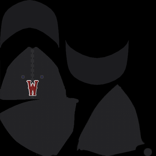 Home:   Away:  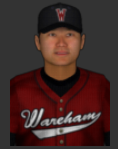 Alternate:  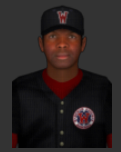
Last edited by Fyrestorm3; 12-19-2012 at 08:55 PM. |
|
|
|
|
12-22-2012, 03:30 AM
|
#6 |
|
Hall Of Famer
Join Date: Aug 2011
Location: Tampa Bay, Massachusetts
Posts: 2,928
|
The Cotuit Kettleers didn't come out too great. The font's wrong, the colors are slightly off... but after two days of trying to get it right, I don't really care anymore. They're good enough.
Logo:  Caps (home/away):   Home: 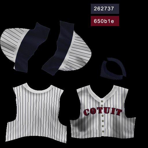  Away:   Alternate: 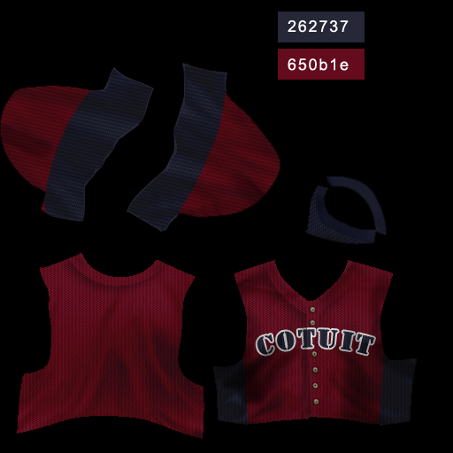 
|
|
|
|
|
12-22-2012, 10:20 AM
|
#7 |
|
Hall Of Famer
Join Date: Oct 2010
Location: Former Southie
Posts: 2,141
|
These are awesome, mate ... I am planning on creating the CCBL Assn because of your touch with both the Unis and the logos ... as well as remembering my youthful days rendezvous along the shore of Massachusetts' coastline ... many thanks, mate ...

__________________
Always a pleasure to stop in and visit the neighborhood!! 
|
|
|
|
|
12-23-2012, 03:49 AM
|
#8 |
|
Hall Of Famer
Join Date: Aug 2011
Location: Tampa Bay, Massachusetts
Posts: 2,928
|
You are quite welcome, Jabez. This is a bigger project than I expected it to be; the Red Sox and the Anglers were simple, but there's a distinct lack of images when it comes to the jersey logos for the others. I've had to do my own text, trying to make it as close as possible to the real thing.
Case in point, the Falmouth Commodores: Logo:  Cap:  Home:   Away:   Alternate: 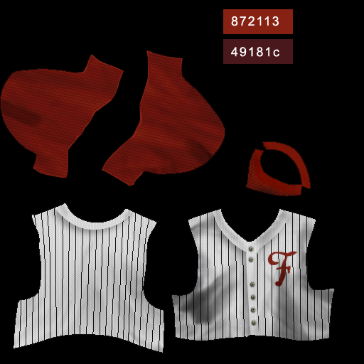 
Last edited by Fyrestorm3; 12-23-2012 at 03:51 AM. |
|
|
|
|
12-23-2012, 04:29 PM
|
#9 |
|
Hall Of Famer
Join Date: Aug 2011
Location: Tampa Bay, Massachusetts
Posts: 2,928
|
The Harwich Mariners are the only team that didn't have to change their logo, since their name actually pre-dated the Seattle Mariners.
Logo:  Caps (Home/Away):   Home:   Away:   Alternate:  
|
|
|
|
|
12-28-2012, 02:06 PM
|
#10 |
|
Hall Of Famer
Join Date: Aug 2011
Location: Tampa Bay, Massachusetts
Posts: 2,928
|
Dear lord, do I hate the Hyannis Harbor Hawks' new logo... their jerseys look pretty sharp, though.
Logo:  Cap:  Home:   Away:   Alternate:  
|
|
|
|
|
12-28-2012, 03:25 PM
|
#11 |
|
Hall Of Famer
Join Date: Oct 2010
Location: Former Southie
Posts: 2,141
|
Really Like this, mate ... Yeah, aside from the name, Mets ... it used to have the hawk's head with the cap on, if I remembered correctly ... otherwise, looking really sharp in all ... White Caps and the Firebirds
 ... ...
__________________
Always a pleasure to stop in and visit the neighborhood!!
Last edited by Jabez54; 12-28-2012 at 05:59 PM. |
|
|
|
|
01-02-2013, 02:14 PM
|
#12 |
|
Hall Of Famer
Join Date: Aug 2011
Location: Tampa Bay, Massachusetts
Posts: 2,928
|
The Orleans Firebirds don't actually have an alternate jersey (as far as I know), so I made one for them.
Logo:  Caps (Home & Away):   Home:   Away: 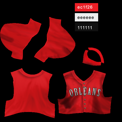  Alternate:  
|
|
|
|
|
01-02-2013, 03:52 PM
|
#13 |
|
Hall Of Famer
Join Date: Oct 2010
Location: Former Southie
Posts: 2,141
|
Really Fabulous Orleans work there, mate ... sheesh, if the local sees this, they would of easily adopted the alternate sets - no question ask !!! ... many thanks!!!
__________________
Always a pleasure to stop in and visit the neighborhood!!
|
|
|
|
|
01-02-2013, 04:03 PM
|
#14 |
|
Hall Of Famer
Join Date: Aug 2011
Location: Tampa Bay, Massachusetts
Posts: 2,928
|
Damn, did the Brewster Whitecaps give me some trouble. I couldn't even find a good-quality version of their logo. Luckily, a Google search led me to a beautiful, fan-made logo from the sportslogos.net forums.
Logo, credit to speedy from sportslogos.net (along with the low-quality original):   Cap: 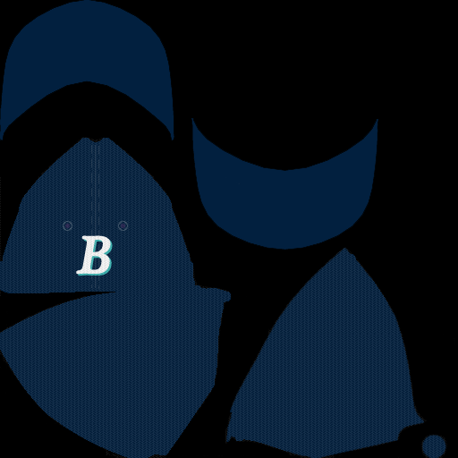 Home:  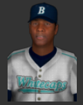 Away: 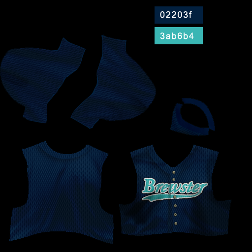  Alternate:  
Last edited by Fyrestorm3; 01-02-2013 at 07:18 PM. |
|
|
|
|
01-02-2013, 04:03 PM
|
#15 |
|
Hall Of Famer
Join Date: Aug 2011
Location: Tampa Bay, Massachusetts
Posts: 2,928
|
And that's that. All 10 teams. That was harder than I expected, but I think the results are pretty good.
|
|
|
|
|
01-02-2013, 06:34 PM
|
#16 |
|
Hall Of Famer
Join Date: Oct 2010
Location: Former Southie
Posts: 2,141
|
More than "pretty good" ... it was done very well, mate !!! ...
   many thanks for doing this project ... it really warm this old chap's heart from his young days of roaming the South Boston ... (Southie) many thanks for doing this project ... it really warm this old chap's heart from his young days of roaming the South Boston ... (Southie) 
__________________
Always a pleasure to stop in and visit the neighborhood!!
|
|
|
|
|
01-02-2013, 06:49 PM
|
#17 | |
|
Hall Of Famer
Join Date: Jun 2004
Posts: 8,736
|
Quote:

__________________
5000+ Generic Logos Free for the Taking FREE: Uniforms and logos for 500+ teams spanning 1871-present Great Lakes League: 10 Conferences, 100 Teams Pre-OOTP 23 Custom Cap & Jersey Template v3.0 by Deft and NoPepper (with layers from other various artists) that I use: Caps, Jerseys |
|
|
|
|
|
01-02-2013, 07:20 PM
|
#18 | |
|
Hall Of Famer
Join Date: Aug 2011
Location: Tampa Bay, Massachusetts
Posts: 2,928
|
Quote:
And this project was about the jerseys, anyway. If I ever package them up for distribution, that logo won't be included, since it's not my work. |
|
|
|
|
|
01-02-2013, 07:47 PM
|
#19 |
|
Hall Of Famer
Join Date: Apr 2004
Location: Dedham, MA
Posts: 10,130
|
This is great work! As someone whose folks live in Falmouth, I followed the commodores when I was younger. My little bro was bat boy one summer in the early 90's. Many thanks!
__________________
Senior "Nancy Boy" of the OOTP Boards _______________________________________________ |
|
|
|
|
01-02-2013, 07:53 PM
|
#20 |
|
Hall Of Famer
Join Date: Feb 2004
Location: Somerset, NJ via Brooklyn, NY
Posts: 2,308
|
Great work!

__________________
"I'm not concerned with your liking or disliking me... All I ask is that you respect me as a human being." -Jackie Robinson, #42 Brooklyn Dodgers "Hitting is better than sex." - Reggie Jackson |
|
|
|
 |
| Bookmarks |
|
|


