 |
|
Latest News:
OOTP 26 Available
- FHM 12 Available
- OOTP Go! Available
Out of the Park Baseball 26 Buy Now! |

|
|
||||
| ||||
 01-31-2012, 02:09 PM
|
#1 |
|
Bat Boy
Join Date: Jan 2012
Posts: 14
|
can anyone help editing this logo
-I need the gray to be darker and the orange to be darker and brighter,
-I want the "katy" & "baseball" to be in the orange - "spartans" --colors to be inverted --darker/brighter orange as the main letters-with the darker grey used to border it 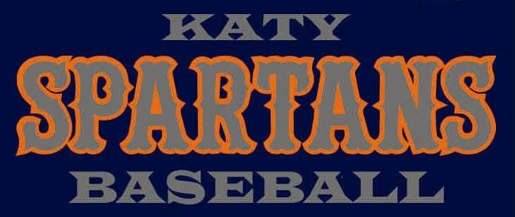
|

|

|
|
01-31-2012, 08:45 PM
|
#2 |
|
Minors (Single A)
Join Date: Oct 2011
Posts: 98
|
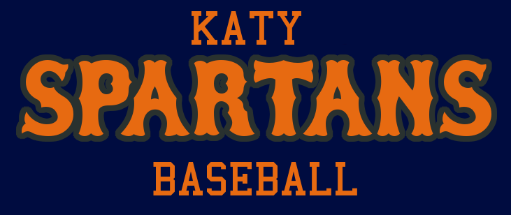
This isn't really an edited version but more of an "adaptation" or spin-off...
|
|
|
|
 |
| Bookmarks |
|
|


