|
|
Latest News:
OOTP 26 Available
- FHM 12 Available
- OOTP Go! Available
Out of the Park Baseball 26 Buy Now! |

|
|
||||
| ||||
 02-21-2011, 07:11 AM
|
#1 |
|
Minors (Single A)
Join Date: Mar 2009
Posts: 86
|
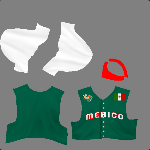
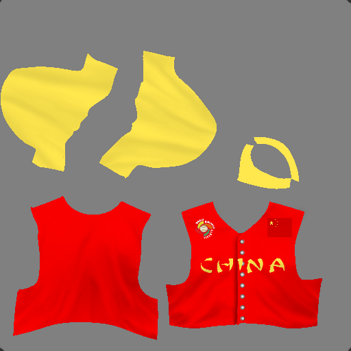
My first created uniforms for my league
I know they look amateurish and mediocre but considering what I was using before (general uniforms created by AI) I like them. They are at least a start for me.
I based them off of Marberi's and fhomess WBC pack. Thanks again for the help. I also have the caps for these 4 teams done as well, just dont have them on photobucket yet. So I would like to here your ideas about how to improve them. I've still got about 40 more countries to do. 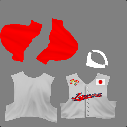 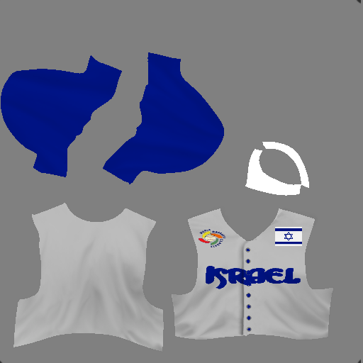 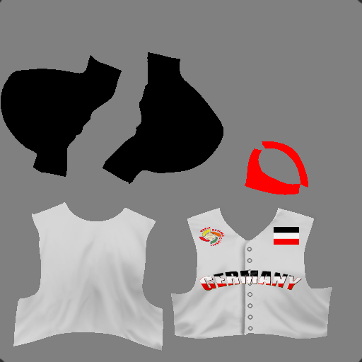 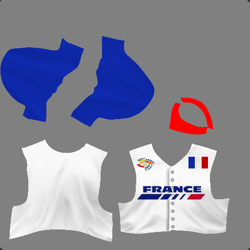
Last edited by Eamus Catuli; 02-21-2011 at 07:25 AM. Reason: Helps if I actually post the uniforms |

|

|
|
02-21-2011, 11:47 AM
|
#2 |
|
All Star Starter
Join Date: Apr 2007
Posts: 1,140
|
Very nice for your first attempts. I don't know what program you are using, but if you are using something with layers, I would suggest putting the text and logos below the shading of the jersey.
__________________
Heartland Baseball League Commissioner Fictional - Stats Only - 30 years of History! HBL HOME PAGE | HBL REPORTS HOME | HBL UTILITIES HOME |
|
|
|
|
02-21-2011, 01:55 PM
|
#3 |
|
All Star Reserve
Join Date: Nov 2009
Location: Puebla, Mexico
Posts: 562
|
I agree w/udbacker: very good for a first try, Eamus. Still, I'd strongly recommend to pick up Photoshop or PaintShopPro, since the best custom cap & uni templates have been made in those programs, far as I know. That's how you'll get the best and most realistic effects (shadows, textures, buttons, stripes, side-panels, etc.)
Edit: Oh and the colors for the German flag should be black, red and yellow (we wouldn't want Markus and co. to get upset for getting their home country's colors wrong!  ) )
Last edited by Marberi; 02-21-2011 at 01:58 PM. |
|
|
|
|
02-21-2011, 04:47 PM
|
#4 |
|
Minors (Single A)
Join Date: Mar 2009
Posts: 86
|
Thanks guys
ya I went with the Imperial German Colors instead.  Anyway If someone could explain to me how to put the logos under the shading i'd appreciate it. Im using paint.net btw. |
|
|
|
|
02-21-2011, 07:33 PM
|
#5 | |
|
Major Leagues
Join Date: Sep 2009
Posts: 319
|
Quote:
__________________
Check out my OOTP-inspired novel "Lord Bart and the Leagues of SIP and ALE"! |
|
|
|
|
|
02-21-2011, 11:36 PM
|
#6 |
|
Minors (Single A)
Join Date: Mar 2009
Posts: 86
|
Starting over isnt a problem, ive only done those 4 but I dont understand this whole layer business everyone keeps mentioning. I see the layer option at the top but I have no idea how to actually use it.
If someone could basically set me up with detailed instructions on how to use it, i'd appreciate it tremendously. Oh and the shading was already on the uniforms, I just changed some logos and some colors. Last edited by Eamus Catuli; 02-21-2011 at 11:43 PM. |
|
|
|
|
02-21-2011, 11:50 PM
|
#7 |
|
All Star Reserve
Join Date: Dec 2005
Location: In a fictional baseball world
Posts: 843
|
I don't have paint.net but I assume the program is a somewhat simplified version of the expensive brands.
Basically, once you are in the editor, you will see a list of your layers for the image you are working on. What you DON'T want to do is add everything in one layer. For instance, this is an example of how the layers might be stacked: shading name logo jersey background Think of it like a sandwich. In the above example, 'shading' is above 'name' in the list on your screen, and thus the shading will appear on top of the name in your image. You won't see the squared off corners of the name/logo file as in your example here in this thread, because you'd have your shading layer on top, hiding those logo edges. In your case, you erred in that you (I assume) have the name or logo (however it is labeled) above the shading layer in your list. Thus, your list probably (incorrectly) looks something like this: name logo shading jersey background In conclusion, whatever you want to show up on top of your image needs to be listed first in the layer stack. Whatever you want as the base of your image needs to be listed last, at the bottom of your layers stack. Most programs will let you easily just drag your layers up and down in the list via your mouse so that you can put them in the order you prefer. I hope that helps a little. If you are confused, just google photoshop or paint shop pro tutorials about using layers. Even though those programs are different from yours, you'll get the general gist of how layers work and be able to apply the knowledge to your own program. Good luck. 
__________________
Last edited by stevebydac; 02-21-2011 at 11:54 PM. |
|
|
|
|
02-22-2011, 12:04 AM
|
#8 |
|
Minors (Single A)
Join Date: Mar 2009
Posts: 86
|
Ok so I have paint.net open and I have two layers open: Background and jerseys. Now where do I find the shading? If the shading is already in there do I still need to add a shading layer or can i just go to logo and then name?
Once I put the logo on the jersey do I need to to do any special effects with it to make it blend in with the jersey or will this layering process do that for me? Also by name what do you mean? The file name or just the name of the jersey in general? I realize now this 'shading' option is supposed to make the edges blend in but under the options on the top of the program I dont see any option named shading. Last edited by Eamus Catuli; 02-22-2011 at 12:17 AM. |
|
|
|
|
02-22-2011, 05:12 AM
|
#9 | |
|
All Star Reserve
Join Date: Mar 2003
Posts: 907
|
Quote:
The shadings are a template. They look like this: Basically, the layers are seperate parts that you work on one-at-a-time, and then merge together. For example, the "Name" they're mentioning is the text on the uniforms. You would create a new layer for that and then use your text tools to get what you want. Then merge it down onto your other layers. The logo is a seperate layer, etc. Turn off any layers you're not working on...it just confuses you. Oh yeah, I think you can find the shadings on Padrefans website. Look under Facegen>Other. http://www.padresfanmods.net/
__________________
Peace, albatross Last edited by albatross11; 02-22-2011 at 05:15 AM. |
|
|
|
|
|
02-22-2011, 10:20 AM
|
#10 |
|
All Star Starter
Join Date: Aug 2009
Location: Plymouth, Ma.
Posts: 1,936
|
Here are 3 effects layers you can add to give some more detail to the jerseys. A Buttons layer, a White Piping layer and a Black Piping layer.
I dont have the original links, nor do I recall who the original creators were. Somewhere along the line, ive collected layers/ideas/images from Batboy, Deft, NoPepper, Silvan, Reds1, Athletics17, Davwms, Tombair, RY1220 and others. So credit goes to the 'collective'!. (the black dots in the corners are there to make sure I keep the layers aligned properly.
|
|
|
|
|
02-23-2011, 01:15 AM
|
#11 |
|
Bat Boy
Join Date: Feb 2009
Posts: 11
|
|
|
|
|
|
03-01-2011, 03:04 AM
|
#12 |
|
Minors (Single A)
Join Date: Mar 2009
Posts: 86
|
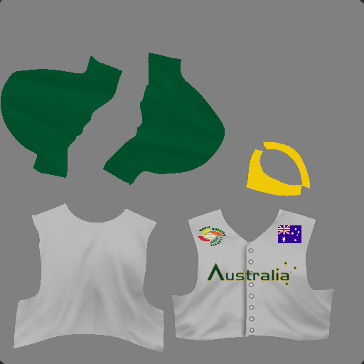
Thanks again for everyones help and advice. I've been doing some work on some uni's and I hope it at least shows some improvement.
Two Teams from the European Divison who just happen to be bitter rivals.. 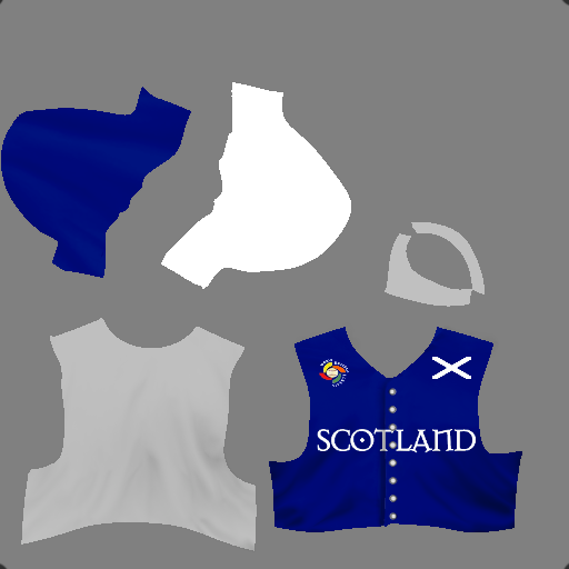 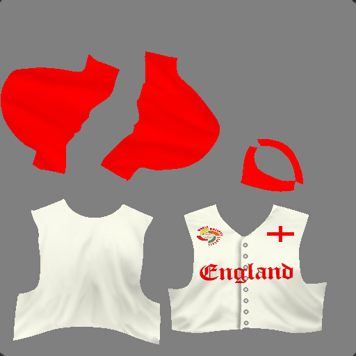 USA-North 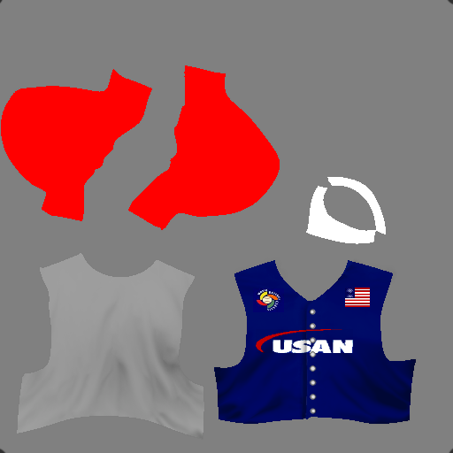
Last edited by Eamus Catuli; 03-01-2011 at 04:00 AM. Reason: Because I can't spell worth a damn at 2 in the morning.. |
|
|
|
|
03-02-2011, 11:08 AM
|
#13 |
|
All Star Starter
Join Date: Aug 2009
Location: Plymouth, Ma.
Posts: 1,936
|
Those look very nice. Excellent work.
|
|
|
|
|
03-02-2011, 09:09 PM
|
#14 |
|
All Star Reserve
Join Date: Nov 2009
Location: Puebla, Mexico
Posts: 562
|
Yep, those definitely look good, Eamus. Love the font styles you chose for all three teams. Very apropos.
|
|
|
|
|
03-03-2011, 01:00 AM
|
#15 |
|
All Star Starter
Join Date: Apr 2007
Posts: 1,140
|
Looking good! If I may offer a small bit of constructive criticism, you may consider adding a stroke (outline) around the nation flags to help them stand out a little better and not blend into the jersey.
__________________
Heartland Baseball League Commissioner Fictional - Stats Only - 30 years of History! HBL HOME PAGE | HBL REPORTS HOME | HBL UTILITIES HOME |
|
|
|
|
03-03-2011, 02:31 AM
|
#16 |
|
Minors (Single A)
Join Date: Mar 2009
Posts: 86
|
Thanks guys..
How do I add an outline to it? |
|
|
|
|
03-03-2011, 04:14 PM
|
#17 |
|
All Star Starter
Join Date: May 2007
Location: Connecticut
Posts: 1,235
|
I don't use Paint.net so one way to add a stroke to the flag is to create a rectangle that is a little larger than the flag on the layer below the flag. This will give the flag a border or 'stroke' in Photoshop speak. Just use a color that provides a little contrast from the uniform and flag colors.
|
|
|
|
|
03-13-2011, 02:00 AM
|
#18 |
|
Minors (Single A)
Join Date: Mar 2009
Posts: 86
|
So i've done about 24 teams so far. Im still working on that suggestion of using a stroke to outline the flag on the uniform. None of these have that yet, but for right now it's ok. Here are a few of the better ones i've done..
   USA East 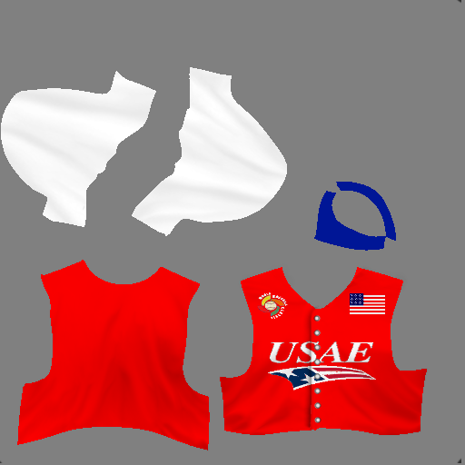
|
|
|
|
 |
| Bookmarks |
|
|