Home | Webstore
Latest News: OOTP 25 Available - FHM 10 Available - OOTP Go! Available

Out of the Park Baseball 25 Buy Now!


Go Back   OOTP Developments Forums > Prior Versions of Our Games > Out of the Park Baseball 17 > OOTP 17 - General Discussions

OOTP 17 - General Discussions Everything about the latest Out of the Park Baseball - officially licensed by MLB.com and the MLBPA.

Reply
 
Thread Tools
Old 12-17-2016, 01:53 PM   #161
cavebutter
All Star Starter
 
cavebutter's Avatar
 
Join Date: Dec 2005
Location: Los Angeles
Posts: 1,158
Sorry I don't have screenshots to support this, but I have a couple of suggestions for the interface in the league history section.
From the league history index, click on a subleague and year. The screen that it takes you to is something of an index for that sub league and year- but nowhere on that screen does it show the year you are looking at. Not in the body, and more importantly, not in the header. It should.

Then, from that screen, if you click on the batting register for that year and try to sort by one of the stats, something goes wrong and you have the first entry superimposed on top of the column header. This is likely more of a bug than a interface request and I will post this there next time I'm at my game computer.


Sent from my iPhone using Tapatalk
__________________
MySQL, MyStruggle - A self-indulgent blog about my attempts to roll my own MySQL Database with OOTP

Logo Gallery
cavebutter is offline   Reply With Quote
Old 12-18-2016, 08:34 PM   #162
spacer15415
Major Leagues
 
spacer15415's Avatar
 
Join Date: Sep 2006
Location: Indianapolis
Posts: 391
I would like the ability to move the rows of stats in whatever order I want. I want to be able to move war closer to another stat and so on, just easier to compare when you have a bunch of numbers on screen.
spacer15415 is offline   Reply With Quote
Old 12-18-2016, 09:06 PM   #163
MidKnight
Major Leagues
 
MidKnight's Avatar
 
Join Date: Nov 2003
Location: Milwaukee, WI
Posts: 396
Now this is my sort of topic! I planned on creating a rough wireframe to express my thoughts but instead decided to mock up a design as a conversation starter. It gave me a nice excuse to check out Adobe XD, anyway!

While there's a screenshot at the end, some caveats first:
  • On a real project, I would spend time gathering information that didn't happen here. Stakeholder interviews, sifting through analytics, user testing, etc. This can take a month or more depending on size of the project. Instead, I'm just an audience of one here (which is dangerous!). So the mockup here is just to foster conversation.
  • My work usually entails wireframes and prototypes, not actually building out a visual interface. So please be kind
The challenge I see with OOTP is that it has to present a lot of information. Stats, options, news, four (or more!) levels of navigation. I can't imagine the headaches Markus and the rest of the gang have to go through to figure out how to present the information, much less in a way that scales with resolution and appeals to both new users and the veterans alike.

I usually find browsing the competition to be a good place to start. The problem is, OOTP doesn't have a lot direct competitors. Football Manager is a good start, but otherwise, I've found that console games don't often present lots of text information well.

What I did find, however, is that there is a place where very similar information has to be presented to users: sports websites. While more like indirect competitors, sites such as ESPN, SI, and even the Premiere League have to organize and display information that is similar to OOTP.

So I took a cue from them and "borrowed" some of how they structure and display their information. After all - it's probably innately familiar to a lot of OOTP users and could make things less overwhelming to new users.

While I'm not usually much of a fan of material design cards, I used them here as they do a decent enough job of segmenting information, something that provides visual hierarchy and makes it easier to find specific pieces of information. I'm an OOTP5 vet and even I have difficulty easily finding what I'm looking for on many screens.

I tried to use dropdowns in the menus to limit the amount of information presented at once. That said, keeping sections highlighted helps provide breadcrumbs to get back. I added hotlinks at the bottom for the pros who want quick access to their pages. Overall, there is less information presented at once, but I believe doing so in a clear visual hierarchy makes it easier to navigate and quickly find what you're looking for.

Anyway, take a look below and let me know if you have any thoughts. There's obviously a lot of functionality assumed in the mockup, but I figure it's a continuation of the dialogue.
Attached Images
Image 
MidKnight is offline   Reply With Quote
Old 12-20-2016, 02:54 AM   #164
PSUColonel
Hall Of Famer
 
PSUColonel's Avatar
 
Join Date: Feb 2002
Posts: 12,988
Blog Entries: 37
This is just one example (there are many others) where the logo just doesn't stand out due to a lack of color contrast. Perhaps make the area where the logo is much lighter so logos will stand out...or at least make that area customizable.?
Attached Images
Image 
PSUColonel is offline   Reply With Quote
Old 12-20-2016, 08:10 AM   #165
mitchkenn
Hall Of Famer
 
mitchkenn's Avatar
 
Join Date: Jan 2015
Location: Oregon, not by design
Posts: 2,853
Quote:
Originally Posted by PSUColonel View Post
This is just one example (there are many others) where the logo just doesn't stand out due to a lack of color contrast. Perhaps make the area where the logo is much lighter so logos will stand out...or at least make that area customizable.?
i've asked for the same thing. hopefully it's not a hard thing to fix.
__________________
"This is my opening farewell " - Jackson Browne
“They make a desolation and call it peace.” ― Agha Shahid Ali
"Maybe she just has to sing, for the sake of the song - And who do I think that I am to decide that she's wrong." - Townes Van Zandt
"I saw a young man leaning on his wooden crutch - He called out to me, 'Don't ask for so much' And a young woman leaning in her darkened door She cried out to me, 'Why not ask for more?' " - Leonard Cohen
"Hello darkness, my old Friend ...." - Paul Simon
Before Mays, before DiMaggio, there was Oscar Charleston.
"All the lies about Babe Ruth are true." - Waite Hoyt

Avatar is the late great Townes Van Zandt. rip.
mitchkenn is offline   Reply With Quote
Old 12-20-2016, 03:13 PM   #166
PSUColonel
Hall Of Famer
 
PSUColonel's Avatar
 
Join Date: Feb 2002
Posts: 12,988
Blog Entries: 37
If it were designed similarly to midnight's suggestion...it wouldn't be a problem.
PSUColonel is offline   Reply With Quote
Old 12-22-2016, 10:11 AM   #167
JasonC23
All Star Reserve
 
Join Date: Mar 2002
Location: Huntley, IL
Posts: 865
On the Front Office screen, there is a graph of your team's winning percentage over the past decade. When you hover over the individual years, up pops...the same winning percentage that you see in the graph. It would be more helpful if the pop-up was your team's record that year, rather than duplicated information.
JasonC23 is offline   Reply With Quote
Old 12-22-2016, 03:14 PM   #168
Anthony5967
Minors (Single A)
 
Join Date: Jan 2014
Posts: 89
Quote:
Originally Posted by MidKnight View Post
Now this is my sort of topic! I planned on creating a rough wireframe to express my thoughts but instead decided to mock up a design as a conversation starter. It gave me a nice excuse to check out Adobe XD, anyway!

While there's a screenshot at the end, some caveats first:
  • On a real project, I would spend time gathering information that didn't happen here. Stakeholder interviews, sifting through analytics, user testing, etc. This can take a month or more depending on size of the project. Instead, I'm just an audience of one here (which is dangerous!). So the mockup here is just to foster conversation.
  • My work usually entails wireframes and prototypes, not actually building out a visual interface. So please be kind
The challenge I see with OOTP is that it has to present a lot of information. Stats, options, news, four (or more!) levels of navigation. I can't imagine the headaches Markus and the rest of the gang have to go through to figure out how to present the information, much less in a way that scales with resolution and appeals to both new users and the veterans alike.

I usually find browsing the competition to be a good place to start. The problem is, OOTP doesn't have a lot direct competitors. Football Manager is a good start, but otherwise, I've found that console games don't often present lots of text information well.

What I did find, however, is that there is a place where very similar information has to be presented to users: sports websites. While more like indirect competitors, sites such as ESPN, SI, and even the Premiere League have to organize and display information that is similar to OOTP.

So I took a cue from them and "borrowed" some of how they structure and display their information. After all - it's probably innately familiar to a lot of OOTP users and could make things less overwhelming to new users.

While I'm not usually much of a fan of material design cards, I used them here as they do a decent enough job of segmenting information, something that provides visual hierarchy and makes it easier to find specific pieces of information. I'm an OOTP5 vet and even I have difficulty easily finding what I'm looking for on many screens.

I tried to use dropdowns in the menus to limit the amount of information presented at once. That said, keeping sections highlighted helps provide breadcrumbs to get back. I added hotlinks at the bottom for the pros who want quick access to their pages. Overall, there is less information presented at once, but I believe doing so in a clear visual hierarchy makes it easier to navigate and quickly find what you're looking for.

Anyway, take a look below and let me know if you have any thoughts. There's obviously a lot of functionality assumed in the mockup, but I figure it's a continuation of the dialogue.
Love this.
Anthony5967 is offline   Reply With Quote
Old 12-22-2016, 05:12 PM   #169
RchW
Hall Of Famer
 
RchW's Avatar
 
Join Date: Jul 2004
Location: The big smoke
Posts: 15,628
Quote:
Originally Posted by David Watts View Post
So 17 is that much more demanding of a computer than 16? What was added that causes this?
Are you on win 10. It has serious overhead and bloat. I never saw the spinner until win 10 with 17.
__________________
Cheers

RichW

If you’re looking for a good cause to donate money to please consider a Donation to Parkinson’s Canada. It may help me have a better future and if not me, someone else. Thanks.

“Conservatism consists of exactly one proposition …There must be in-groups whom the law protects but does not bind, alongside out-groups whom the law binds but does not protect.” Frank Wilhoit
RchW is offline   Reply With Quote
Old 12-22-2016, 05:17 PM   #170
David Watts
Hall Of Famer
 
David Watts's Avatar
 
Join Date: Apr 2002
Location: Looking for a place called Leehofooks
Posts: 8,865
Quote:
Originally Posted by RchW View Post
Are you on win 10. It has serious overhead and bloat. I never saw the spinner until win 10 with 17.
If I remember right, I upgraded to 10 after I installed 17. I had the spinner prior to Windows 10. Not sure if it was this thread or another, but a couple folks with monster gaming machines have said they have the spinning wheel as well. It's not my machine. The whole spinning wheel thing is pretty much "hey kids get offa my lawn" thingy. Things are going to change as the game grows. I'll get over it......and I still play the heck out of 16, so its not a big deal

Last edited by David Watts; 12-22-2016 at 05:51 PM.
David Watts is offline   Reply With Quote
Old 12-22-2016, 08:22 PM   #171
BKL
All Star Reserve
 
Join Date: Feb 2002
Posts: 921
View for "Stats Only" Gameplay

Not sure if this was already written, but it would be nice to have a view or an option for a "Stats Only" interface for player screens. If you want to play with stats only, it looks kind of weird having all the player ratings as blanks. Maybe there could be something in place of the ratings, like BA, OBP, SLG, ERA, etc.
BKL is offline   Reply With Quote
Old 12-22-2016, 09:09 PM   #172
USF
All Star Starter
 
USF's Avatar
 
Join Date: Oct 2011
Location: Maple, ON - Canada
Posts: 1,058
I would like to have Pitch Count available for the bullpen on this screen to save a step. See picture.

I don't find the stats given on the far right useful at all when I can see them above on this pitcher screen anyway(not shown). So I'd ask to replace them with a simple Pitch Count which I feel is important.


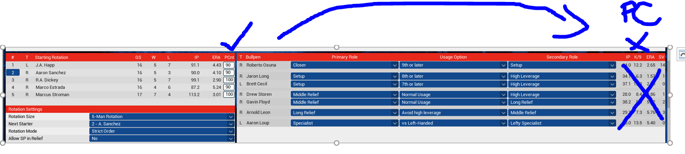
While I'm at it, lets combine the Hook for SP and RP on the same screen. The room you save by eliminating the Stats for the bullpen might allow for this. Plus the role(s) and option boxes are Huge currently (again more room to save)


So beside each pitcher on the pitcher screen (image 1) will have their hook and pitch count shown.
__________________
Commissioner of the ABL
http://www.usfleagues.net/website/


Last edited by USF; 12-22-2016 at 09:28 PM.
USF is offline   Reply With Quote
Old 12-23-2016, 11:32 AM   #173
IStillDream
Minors (Double A)
 
Join Date: Jan 2013
Posts: 164
It might not be to everyone's taste, but an option for an onscreen popup box showing what relievers are warming up and their readiness state would be great. As is, I find myself paging back and forth between the game screen and the substitution screen with each at bat until I see someone is ready to come in. Also, keeping it visible onscreen would help prevent the problem–which has cost me a couple of games–of sitting down a reliever while I'm batting to keep them from getting tired, then forgetting to get them back up before the inning ends.
IStillDream is offline   Reply With Quote
Old 12-24-2016, 02:58 AM   #174
SaoMagnifico
Minors (Double A)
 
SaoMagnifico's Avatar
 
Join Date: Dec 2015
Posts: 143
Quote:
Originally Posted by IStillDream View Post
It might not be to everyone's taste, but an option for an onscreen popup box showing what relievers are warming up and their readiness state would be great. As is, I find myself paging back and forth between the game screen and the substitution screen with each at bat until I see someone is ready to come in. Also, keeping it visible onscreen would help prevent the problem–which has cost me a couple of games–of sitting down a reliever while I'm batting to keep them from getting tired, then forgetting to get them back up before the inning ends.
In the same vein, being able to reference upcoming batters' season stats and L/R splits would be awesome. Just more functionality in the mold of what actual managers have -- that'd be great.
SaoMagnifico is offline   Reply With Quote
Old 12-26-2016, 03:55 PM   #175
Bobfather
All Star Starter
 
Join Date: Jun 2016
Location: Boston Ma.
Posts: 1,214
Not sure if this is interface suggestion but here I am. Please update the trivia. Who care that it took forever for some guy I never heard of to get in the Hall. I would like to see more stuff about my leafue. Scores, Statistics and factoids. Instead of the same trivia questions over and over. Love the game though, keep up the good work.
Bobfather is offline   Reply With Quote
Old 12-26-2016, 04:04 PM   #176
pstrickert
Hall Of Famer
 
pstrickert's Avatar
 
Join Date: Dec 2005
Posts: 15,738
Bobfather, the hints.txt (containing the trivia tidbits) is much smaller than it used to be. MLB now has to approve the contents of the file. The full-size file actually contains 4000 entries (about 3x more entries compared to the default file, if not more). So, that's part of the problem with repetition.
pstrickert is online now   Reply With Quote
Old 12-26-2016, 04:13 PM   #177
pstrickert
Hall Of Famer
 
pstrickert's Avatar
 
Join Date: Dec 2005
Posts: 15,738
Quote:
Originally Posted by MidKnight View Post
Now this is my sort of topic! I planned on creating a rough wireframe to express my thoughts but instead decided to mock up a design as a conversation starter. It gave me a nice excuse to check out Adobe XD, anyway!

While there's a screenshot at the end, some caveats first:
  • On a real project, I would spend time gathering information that didn't happen here. Stakeholder interviews, sifting through analytics, user testing, etc. This can take a month or more depending on size of the project. Instead, I'm just an audience of one here (which is dangerous!). So the mockup here is just to foster conversation.
  • My work usually entails wireframes and prototypes, not actually building out a visual interface. So please be kind
The challenge I see with OOTP is that it has to present a lot of information. Stats, options, news, four (or more!) levels of navigation. I can't imagine the headaches Markus and the rest of the gang have to go through to figure out how to present the information, much less in a way that scales with resolution and appeals to both new users and the veterans alike.

I usually find browsing the competition to be a good place to start. The problem is, OOTP doesn't have a lot direct competitors. Football Manager is a good start, but otherwise, I've found that console games don't often present lots of text information well.

What I did find, however, is that there is a place where very similar information has to be presented to users: sports websites. While more like indirect competitors, sites such as ESPN, SI, and even the Premiere League have to organize and display information that is similar to OOTP.

So I took a cue from them and "borrowed" some of how they structure and display their information. After all - it's probably innately familiar to a lot of OOTP users and could make things less overwhelming to new users.

While I'm not usually much of a fan of material design cards, I used them here as they do a decent enough job of segmenting information, something that provides visual hierarchy and makes it easier to find specific pieces of information. I'm an OOTP5 vet and even I have difficulty easily finding what I'm looking for on many screens.

I tried to use dropdowns in the menus to limit the amount of information presented at once. That said, keeping sections highlighted helps provide breadcrumbs to get back. I added hotlinks at the bottom for the pros who want quick access to their pages. Overall, there is less information presented at once, but I believe doing so in a clear visual hierarchy makes it easier to navigate and quickly find what you're looking for.

Anyway, take a look below and let me know if you have any thoughts. There's obviously a lot of functionality assumed in the mockup, but I figure it's a continuation of the dialogue.
I, for one, have complained about data overload on many OOTP screens. (The complaining, btw, hasn't done much good.) I like what you've done. I think a simpler, cleaner presentation is more important than jamming too much info in front of the user. If tabs are used (or mouse-over popups), more info can be accessed, if desired. The in-game widgets, IMO, are among the worst offenders. (And I've complained about them repeatedly.) The batter and pitcher widgets, in particular, are almost unreadable when a player compiles a season's (or several season's) worth of data. Not only is too much info presented, it is displayed using a relatively small font size.
pstrickert is online now   Reply With Quote
Old 12-26-2016, 04:32 PM   #178
pstrickert
Hall Of Famer
 
pstrickert's Avatar
 
Join Date: Dec 2005
Posts: 15,738
Here's a suggestion. OOTP allows users little opportunity to add photos. In historical leagues, we can add a ballpark photo and a single photo for each player. But that's about it. How about allowing the user to add a gallery of ballpark photos (e.g., photos of one of the ballpark entrances, statues erected, monuments, historical banners, souvenirs, etc.) or action photos (e.g., photos of live game action, brawls, disputes with umpires, dugout scenes, etc.) or photos which capture historic achievements (e.g., no-hitters, championship celebrations, etc.)? The game could then draw from this gallery of photos to enhance different screens. The onus would, for the most part, fall upon users.
pstrickert is online now   Reply With Quote
Old 12-26-2016, 04:47 PM   #179
mitchkenn
Hall Of Famer
 
mitchkenn's Avatar
 
Join Date: Jan 2015
Location: Oregon, not by design
Posts: 2,853
Quote:
Originally Posted by pstrickert View Post
Bobfather, the hints.txt (containing the trivia tidbits) is much smaller than it used to be. MLB now has to approve the contents of the file. The full-size file actually contains 4000 entries (about 3x more entries compared to the default file, if not more). So, that's part of the problem with repetition.
you can easily add to this. i found an old book of baseball quotes and added another 50 or so to the list. Only problem is every time game updates, you have to reload the "new" hints. So, i saved them in a file and just plug them in when needed.
__________________
"This is my opening farewell " - Jackson Browne
“They make a desolation and call it peace.” ― Agha Shahid Ali
"Maybe she just has to sing, for the sake of the song - And who do I think that I am to decide that she's wrong." - Townes Van Zandt
"I saw a young man leaning on his wooden crutch - He called out to me, 'Don't ask for so much' And a young woman leaning in her darkened door She cried out to me, 'Why not ask for more?' " - Leonard Cohen
"Hello darkness, my old Friend ...." - Paul Simon
Before Mays, before DiMaggio, there was Oscar Charleston.
"All the lies about Babe Ruth are true." - Waite Hoyt

Avatar is the late great Townes Van Zandt. rip.
mitchkenn is offline   Reply With Quote
Old 12-26-2016, 11:13 PM   #180
pstrickert
Hall Of Famer
 
pstrickert's Avatar
 
Join Date: Dec 2005
Posts: 15,738
I posted a copy of the full hints.txt file a few months ago. Unofficial, of course.
pstrickert is online now   Reply With Quote
Reply

Bookmarks

Thread Tools

Posting Rules
You may not post new threads
You may not post replies
You may not post attachments
You may not edit your posts

BB code is On
Smilies are On
[IMG] code is On
HTML code is Off

Forum Jump


All times are GMT -4. The time now is 09:43 PM.


Major League and Minor League Baseball trademarks and copyrights are used with permission of Major League Baseball. Visit MLB.com and MiLB.com.

Officially Licensed Product – MLB Players, Inc.

Out of the Park Baseball is a registered trademark of Out of the Park Developments GmbH & Co. KG

Google Play is a trademark of Google Inc.

Apple, iPhone, iPod touch and iPad are trademarks of Apple Inc., registered in the U.S. and other countries.

COPYRIGHT © 2023 OUT OF THE PARK DEVELOPMENTS. ALL RIGHTS RESERVED.


Powered by vBulletin® Version 3.8.10
Copyright ©2000 - 2024, vBulletin Solutions, Inc.
Copyright © 2020 Out of the Park Developments