 |
|
Latest News:
OOTP 25 Available
- FHM 10 Available
- OOTP Go! Available
Out of the Park Baseball 25 Buy Now! |

|
|
||||
| ||||
 11-07-2019, 05:11 PM
|
#9881 |
|
Hall Of Famer
Join Date: Dec 2008
Location: "Deep in the Heart Of"
Posts: 8,202
|
Portland Pioneers
Portland Pioneers
I found a concept some time back for this team that was designed by Alex Grigas... I took his idea and some elements from his logo to come up with a similar, simpler looking logo... I take zero credit for the colors or the concept, that is all of his doing... The unis on the other hand are my handi work along with Gern44's template...
__________________
 |

|

|
|
11-07-2019, 05:12 PM
|
#9882 |
|
Hall Of Famer
Join Date: Dec 2008
Location: "Deep in the Heart Of"
Posts: 8,202
|
Portland Pioneers
Alt and road jersey...
__________________
|
|
|
|
|
11-07-2019, 05:24 PM
|
#9883 |
|
Hall Of Famer
Join Date: Dec 2008
Location: "Deep in the Heart Of"
Posts: 8,202
|
New York Dreamers
New York Dreamers I made one of these logos some time back as a request here... Made a set of uniforms to go with it...
__________________
|
|
|
|
|
11-07-2019, 05:25 PM
|
#9884 |
|
Hall Of Famer
Join Date: Dec 2008
Location: "Deep in the Heart Of"
Posts: 8,202
|
New York Dreamers
Uniforms...
__________________
|
|
|
|
|
11-08-2019, 11:18 AM
|
#9887 |
|
Hall Of Famer
Join Date: Dec 2008
Location: "Deep in the Heart Of"
Posts: 8,202
|
Tennessee Statesmen
Tennessee Statesmen
__________________
|
|
|
|
|
11-08-2019, 09:01 PM
|
#9888 |
|
Hall Of Famer
Join Date: Mar 2013
Location: Midland, MI
Posts: 3,421
|
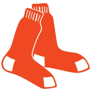
Brooklyn Orange Sox
Since you guys have been helping me out, I'll post one of my creations that I actually thought turned out decent for a change.
|
|
|
|
|
11-09-2019, 12:17 AM
|
#9889 | |
|
Major Leagues
Join Date: Apr 2015
Posts: 389
|
Quote:
Really nice! |
|
|
|
|
|
11-10-2019, 12:35 PM
|
#9890 |
|
Hall Of Famer
Join Date: Dec 2008
Location: "Deep in the Heart Of"
Posts: 8,202
|
Dallas/Texas Rangers Saga 1900- 1970's
Dallas/Texas Rangers Saga 1900- 1970's I reworked my Rangers saga set some time back and never posted them... To many to post so here is a link to the Google Drive folder... https://drive.google.com/open?id=1fyFrKCFRKVkvXzj8pe2dwPrHExUph-eq
__________________
|
|
|
|
|
11-10-2019, 12:37 PM
|
#9891 |
|
Hall Of Famer
Join Date: Dec 2008
Location: "Deep in the Heart Of"
Posts: 8,202
|
Dallas/Texas Rangers Saga 1900- 1970's
Pullover sets 1950-70's...
__________________
|
|
|
|
|
11-15-2019, 04:23 PM
|
#9897 | |
|
Hall Of Famer
Join Date: Mar 2013
Location: Midland, MI
Posts: 3,421
|
Quote:
Thanks for all the great work on these! Could I get the Houston sleeve patch and the Minnesota jersey M to use as team logos? |
|
|
|
|
|
11-16-2019, 12:16 PM
|
#9899 |
|
Hall Of Famer
|
Would someone, please take knuckler's beautiful Bar Harbor Acadians primary logo and create a secondary logo for my new South Island dynasty league... knuckler's logo was part of his Vermont League project.
I just want the fleur de lis by itself… if you would, please make the brown, orange background lighter in shade, so there will be better contrast when used as a secondary logo at 50 x 50 pixels... I don't want the Fleur de Lis to be lost in those colors... a very, very light orange would probably be fine. Right now it doesn't show well on the standings screen at 50 x 50 pixels. I tried to make the secondary logo, but as you see, it didn't come out too well... not a clean job... and the background browns and oranges don't provide good contrast at the 50 x 50 pixel size. Thanks for your help. Last edited by Eugene Church; 11-16-2019 at 07:56 PM. |
|
|
|
|
11-16-2019, 12:27 PM
|
#9900 |
|
Hall Of Famer
|
Here are screenshots of the standings.
#1 shows the poor contrast of the logos... I'm going to have to change all of them... the Claiborne Cardinals and the Opelousas Lions are pretty good.... but I think I could lighten up the background colors and make them better. #2 and #3 are my North Island League standings... because of the black background used on the OOTP skin, I think they look pretty good because of the much better contrast. To help them show up better on the game screens, I always put White borders around all of my primary and secondary logos. Looking at the screenshots. the NIRL First Division Logos show up the best... large Letters are probably the reason... I'm going to lighten up the background colors on several NIRL Second Division logos... Theodore would definitely improve with a lighter shade background behind the Letter T. Last edited by Eugene Church; 11-16-2019 at 12:36 PM. |
|
|
|
 |
| Bookmarks |
| Tags |
| retro logos, retro ootp uniforms |
| Thread Tools | |
|
|


