 |
|
Latest News:
OOTP 26 Available
- FHM 11 Available
- OOTP Go! Available
Out of the Park Baseball 26 Buy Now! |
|
|
||||
| ||||
 05-23-2020, 08:12 PM
|
#1 |
|
Major Leagues
Join Date: Sep 2019
Posts: 494
|
Miami Marlins Update - Throwback Style
I decided to "turn back the clock" on the Miami Marlins much like I did with the Tampa Bay Rays. Many fans still miss the old color scheme and it was under consideration when they moved away from the Loria era in November of 2018. What if they had gone with their traditional color scheme? When rebranding them, I broke them into 3 eras: 1) the 1993 Expansion Marlins 2) the 1997 World Series Champion Marlins 3) the 2003 World Series Champion Marlins.
Note: I found the M logo from a 2014 thread in which it was posted by Spindel when I did a google search. The Miami Marlins logo was also found on a google search. 1993 Expansion Last edited by 1991Twins; 06-12-2020 at 07:46 AM. |

|

|
|
05-23-2020, 08:13 PM
|
#2 |
|
Major Leagues
Join Date: Sep 2019
Posts: 494
|
1997 World Series Champs
Last edited by 1991Twins; 06-12-2020 at 07:47 AM. |
|
|
|
|
05-23-2020, 08:15 PM
|
#3 |
|
Major Leagues
Join Date: Sep 2019
Posts: 494
|
2003 World Series Champs
Last edited by 1991Twins; 05-26-2020 at 05:05 AM. |
|
|
|
|
05-23-2020, 08:16 PM
|
#4 |
|
Major Leagues
Join Date: Sep 2019
Posts: 494
|
Logos from 2014 thread, M logo credit goes to Spindel for posting. The "Miami Marlins" logo I adjusted the tint since it was too dark. For the "M" logos, I just cleaned the "M" logo up so it has a white border instead of turquoise. This caused the logo to more closely match the original "F" design.. As an extra bonus, I cleaned up a version of the blue version of the "M" logo as an alternate choice or for use in a GCL/DSL league. Tip: The "M" logos show up best in game at the default 300 x 300 size that I saved them on.
Last edited by 1991Twins; 05-28-2020 at 04:52 PM. |
|
|
|
|
05-23-2020, 11:56 PM
|
#5 |
|
Hall Of Famer
Join Date: Dec 2001
Location: Phoenix, AZ
Posts: 3,196
|
These are awesome. I recently changed my Marlins franchise back to the Teal and Black but was only able to find Florida Marlins logos. I may have to use yours and stick with Miami

__________________
GM - New Jersey Bears of the NPBL; |
|
|
|
|
05-24-2020, 11:10 AM
|
#6 |
|
Hall Of Famer
Join Date: Mar 2007
Location: Born in Shea Stadium, lives in LoanDepot Park.
Posts: 6,242
|
Where did you find the "Miami" wordmark?
__________________
My Threads: MLB Project 32 by SFGiants58 "Colon looking for his 1st hit of the year and he DRIVES ONE! Deep left field! Back goes Upton! Back near the wall! ITS OUTTA HERE!!! Bartolo has done it!!! THE IMPOSSIBLE HAS HAPPENED!!! This is one of the great moments in the history of baseball! Bartolo Colon has gone deep!" ---Gary Cohen. (May 7, 2016) (Petco Park) NYM 6 @ SD 3 |
|
|
|
|
05-24-2020, 11:40 AM
|
#7 | |
|
Major Leagues
Join Date: Sep 2019
Posts: 494
|
Quote:
|
|
|
|
|
|
05-24-2020, 12:30 PM
|
#8 |
|
All Star Starter
Join Date: Mar 2011
Location: Louisiana
Posts: 1,268
|
These are great.
|
|
|
|
|
05-24-2020, 02:25 PM
|
#9 |
|
Hall Of Famer
Join Date: May 2010
Location: Wisconsin, USA
Posts: 5,979
|
These were so much better than the garbage they have now.
__________________
My fictional team logos and uniforms |
|
|
|
|
05-24-2020, 03:37 PM
|
#10 |
|
Hall Of Famer
Join Date: Apr 2003
Location: Minnesota
Posts: 2,727
|
Oh man. This brings me back to my childhood in Miami. Makes me want to start a Marlins 2020 game and rebrand them back to what they were.
|
|
|
|
|
05-24-2020, 04:22 PM
|
#11 |
|
Hall Of Famer
Join Date: Jun 2014
Location: Juust a bit outside...
Posts: 6,115
|
outstanding!
__________________
"Cannonball Coming!" Go Bucs!! Founder and League Caretaker of the Professional Baseball Circuit, www.probaseballcircuit.com An Un-Official Guide to Minor League Management in OOTP 21 Ratings Scale Conversion Cross-Reference Cheat Sheet |
|
|
|
|
05-24-2020, 08:46 PM
|
#12 |
|
Major Leagues
Join Date: Sep 2019
Posts: 494
|
Thanks for the kind words, I want my league to be realistic with the team names so that meant sticking to the current Miami name. It's crazy to me how easy of a solution this would be to just restore their colors/word marks with the name "Miami" and you have a classic look.
I decided to add 3 new jerseys today. 2 are sleeveless and 1 is the batting practice jersey from 1994 to 2002. Last edited by 1991Twins; 05-26-2020 at 05:06 AM. |
|
|
|
|
05-24-2020, 11:01 PM
|
#13 |
|
Major Leagues
Join Date: Sep 2019
Posts: 494
|
One final addition....I added 2 logos to post 4. I was able to clean up the Marlins batting practice "M" logo with the fish. Instead of the turquoise background like I used on the jersey sleeve patch, it is the standard white outline like the real "F" logo had. I made one of the "M" logos black so that it matched the "F" logo and the other was teal like the real batting practice logo. I posted the teal logo in case someone wanted to use that for a GCL or DSL league. I sized them to 300 x 300 because the detail looked the most accurate to the original logo in game. All in all, I am very pleased with my rebrand effort with 3 eras to choose from. The Marlins are restored to what they should be

Last edited by 1991Twins; 05-24-2020 at 11:03 PM. |
|
|
|
|
05-25-2020, 06:23 AM
|
#14 |
|
Hall Of Famer
Join Date: Feb 2012
Location: Inside The Game
Posts: 30,937
|
For a Twins fan you do great work.
 Thanks for these. I use something similar for the Marlins in my main league but these are cleaner and you made a better logo. Thanks for these. I use something similar for the Marlins in my main league but these are cleaner and you made a better logo.
__________________
Go today don't wait for tomorrow It isn't promised, all the time you get borrowed Don't live your life for other people Don't bottle your emotions till they crack and fill a couple just sorrows Take your mind and refocus go get a paper write your goals out Throw your middle fingers to all your haters "Stay Strong" 
|
|
|
|
|
05-25-2020, 12:06 PM
|
#15 | |
|
Hall Of Famer
Join Date: Mar 2007
Location: Born in Shea Stadium, lives in LoanDepot Park.
Posts: 6,242
|
Quote:
Im having an issue locating it. Both Black and Teal if you could. Edit: Nevermind, I found them. Your ideas gave me a little brainstorm for Project 32!
__________________
My Threads: MLB Project 32 by SFGiants58 "Colon looking for his 1st hit of the year and he DRIVES ONE! Deep left field! Back goes Upton! Back near the wall! ITS OUTTA HERE!!! Bartolo has done it!!! THE IMPOSSIBLE HAS HAPPENED!!! This is one of the great moments in the history of baseball! Bartolo Colon has gone deep!" ---Gary Cohen. (May 7, 2016) (Petco Park) NYM 6 @ SD 3 Last edited by rjl518; 05-25-2020 at 12:13 PM. |
|
|
|
|
|
05-25-2020, 05:50 PM
|
#16 | |
|
Major Leagues
Join Date: Sep 2019
Posts: 494
|
Quote:
|
|
|
|
|
|
05-26-2020, 03:59 AM
|
#17 |
|
Major Leagues
Join Date: Sep 2019
Posts: 494
|
Final changes, I created new ballcaps from scratch. Since I cleaned up the "M" logo for the Miami logo, I noticed that the outlined version more closely matched the original "F" design. The new, upgraded caps are uploaded into their proper season in the posts above. I also fixed each of the jerseys so that the outlined, accurate "M" logo is on each of the sleeves.
Last edited by 1991Twins; 05-26-2020 at 05:07 AM. |
|
|
|
|
05-29-2020, 07:24 PM
|
#18 |
|
Major Leagues
Join Date: Sep 2019
Posts: 494
|
One more...based upon a 1990's batting practice jersey I saw online.
|
|
|
|
|
06-12-2020, 07:49 AM
|
#19 |
|
Major Leagues
Join Date: Sep 2019
Posts: 494
|
I wanted to apologize.
") When playing a game, I noticed that the Miami 1990s gray uniforms did not have the sleeve stripes. To make them fully accurate, I went back and added them. The uniforms have been adjusted where they are posted. I apologize for overlooking this, but they are official now When playing a game, I noticed that the Miami 1990s gray uniforms did not have the sleeve stripes. To make them fully accurate, I went back and added them. The uniforms have been adjusted where they are posted. I apologize for overlooking this, but they are official now 
|
|
|
|
|
03-09-2021, 04:05 PM
|
#20 |
|
All Star Starter
Join Date: Aug 2015
Location: Republic of California
Posts: 1,874
|
Blue (current shade) versions....
I hope no one minds, but the other day I saw the Fish playing in their ST uniforms in the blue color contained in their current logo. I thought they looked great, and wanted to see what their old kits would have looked like in that color instead of the teal. Rather than re-create the wheel (since they're very nice wheels!) I'm re-coloring the logos and things 1991Twins posted before.
So... here's some caps! 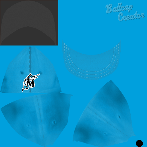 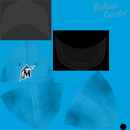 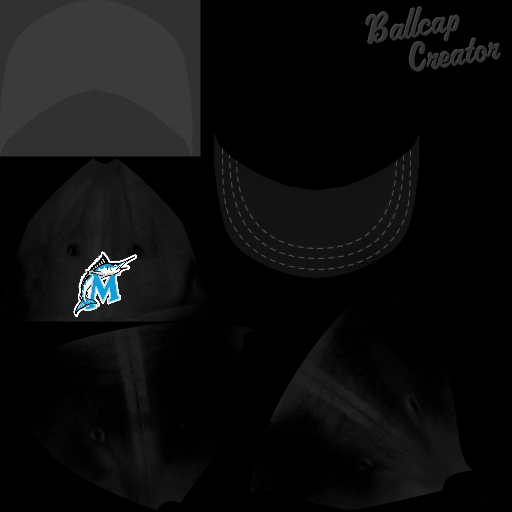 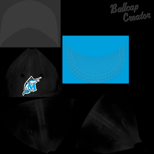
__________________
Let's Go (San Jose) Giants, Let's Go Mets! Current Project: WBAT/AABBA: Organized Base Ball And the "New Normal" World Baseball Aid Tournament 2023 trophy round underway! |
|
|
|
 |
| Bookmarks |
|
|


