|
|
Latest News:
OOTP 26 Available
- FHM 12 Available
- OOTP Go! Available
Out of the Park Baseball 26 Buy Now! |

|
|
||||
| ||||
 01-25-2012, 11:23 AM
|
#1 |
|
Bat Boy
Join Date: Jan 2012
Posts: 14
|
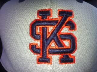
Help turning this into a logo, and improve the interlocking if you have a better idea
can anyone turn this into a usable Logo format, and possibly improve on the Interlocking design I am not very creative and I think it can be better
|

|

|
|
01-25-2012, 11:59 AM
|
#2 |
|
All Star Starter
Join Date: Aug 2009
Location: Plymouth, Ma.
Posts: 1,936
|
Not nearly exact... but hows this?
|
|
|
|
|
01-25-2012, 12:02 PM
|
#3 |
|
Bat Boy
Join Date: Jan 2012
Posts: 14
|
I like the concept, how do I get it in some kind of a file, maybe just thinner orange, thiker navy.... awesome start
|
|
|
|
|
01-25-2012, 12:55 PM
|
#4 |
|
All Star Starter
Join Date: Aug 2009
Location: Plymouth, Ma.
Posts: 1,936
|
You can just RIGHT CLICK on it and select SAVE AS. Its in PNG format.
|
|
|
|
|
01-25-2012, 01:07 PM
|
#5 |
|
All Star Starter
Join Date: Aug 2009
Location: Plymouth, Ma.
Posts: 1,936
|
version 2.
Making the purple 'thicker' is going to be hard, as i didnt alter the base Font much at all. |
|
|
|
|
01-25-2012, 01:30 PM
|
#6 |
|
Bat Boy
Join Date: Jan 2012
Posts: 14
|
ya maybe slightly thicker Orange is needed, is there a way to slightly shorten the K ? so that the image is squared
|
|
|
|
|
01-25-2012, 02:36 PM
|
#7 |
|
All Star Starter
Join Date: Aug 2009
Location: Plymouth, Ma.
Posts: 1,936
|
Are you looking for an exact match, or just something conceptually similiar? If you want exact, you'll have to find the font that matches and let me know what it is, as I can't find a match.
If I shorten the K, it will still not be squared... as the only way to make them squared would be to level the top of the K with the top of the S and the bottom with the bottom. And that would look like crap. Do you mean you want the height of the K to be equal to the width of the S? That would mean 'squishing' the S and extending it horizontally? Anyways, these are probably the best I can do. I dunno where the lack of symmetry comes from... maybe its the fonts im trying to us, or that K and S just dont hug well. I seem to end up with a fat, squat S or a too skinny K. If you could find the exact Font you want, perhaps I can do better. I hope at least one of these is good enough... Last edited by Gern44; 01-25-2012 at 03:57 PM. |
|
|
|
|
01-25-2012, 04:18 PM
|
#8 |
|
Bat Boy
Join Date: Jan 2012
Posts: 14
|
ya the one on the right is pretty dang close , but the S got fat lol
|
|
|
|
|
01-25-2012, 05:24 PM
|
#9 |
|
All Star Reserve
Join Date: Jul 2008
Posts: 861
|
hey, pretty good start, but can u make it so the ratio of thick to thin is the square root of pi? squared? thanx

|
|
|
|
|
01-28-2012, 10:17 AM
|
#10 |
|
Hall Of Famer
Join Date: Jan 2003
Location: Indianapolis
Posts: 2,436
|
Awesome job Gern. if I ever make a team from Saskatchewan this is the logo I'll use.
|
|
|
|
 |
| Bookmarks |
| Thread Tools | |
|
|