Gorgeous! Those kind of graffiti-style graphics make them look much better than my more focused ones, because the top of the helmet distorts any image you put on there.
For the record, in case anyone's wondering, here's what everything in my template is. I'll use a preview from my next installment of the NCAA set (it's coming, I swear):
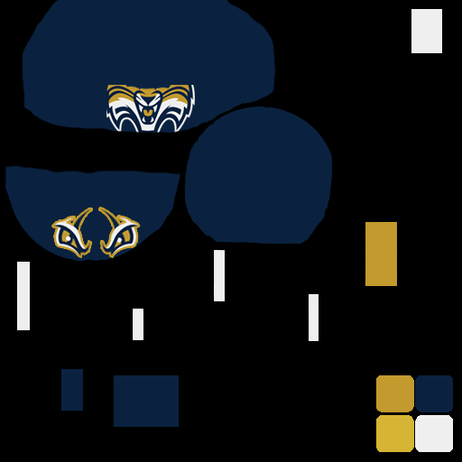
The top circle is the main part of the helmet, specifically the front where the cage attaches, and the chin protector. That chin protector can be colored separately with one of the layers in the template. The border is incredibly rough because all I did was ensure that every visible part of the image was colored. I didn't bother trying to make it pretty.
The half-circle below and to the left is the top of the helmet. Any image put on here gets horribly distorted thanks to the way the game maps the helmet, but with some trial and error you can make it serviceable. The stripes that are on the default helmet are really useful for positioning the graphics.
The circle to the right of that is the back of the helmet. It's not even really necessary, because it doesn't show in the image, but the default template included it, and I didn't see any reason to take it away.
Now, for all the little rectangles. The yellow one in this example is the base color for the facemask. Very simple.
The four tall skinny ones are the straps (that's a much better word than tabs, Pwal, I'mma use it), which are visible to either side of the chin protector, and just barely noticeable on either side at the top.
In the top-right of the template is the rectangle for the studs, which are in fact visible all around the facemask (if you look closely, you can see the little dots of white on top of the gold cage).
The bottom-left rectangle is for the interior of the helmet. One little tiny area shows through in the corner of the face, so I included it as a layer, and I use it to put a darker color in there, if the helmet itself is bright.
The final rectangle next to it is actually for bits and pieces at the top of the helmet. I think it's part of the "interior" showing through, but whatever its intended purpose, it looked terrible. So I just made it part of the base layer for the helmet.
Hope that helps; I know I didn't really explain my template when I posted it before. Which, btw, here it is, if anyone needs it:
helmet_g_template_updated