Sometimes, alternate universes go beyond unreality and into areas of supernatural powers that even I won't tempt.
Naturally, when the Golden Kites needed someone professional to play against, opposition sprang up in the west. Just as the Kanto and Kansai regions of Japan have jostled for prominence and power, so too have their baseball clubs.
The winning team name suggestion came from a railway employee who had recently visited
Detroit Chicago, a similarly industrial city mirroring Osaka, and thought that their ballclub would be worth emulating.
Little did he know he was siccing
two curses from our universe on this team, but it's not like the fans notice. All of the Keihanshin area adores their...
Kansai Cubs

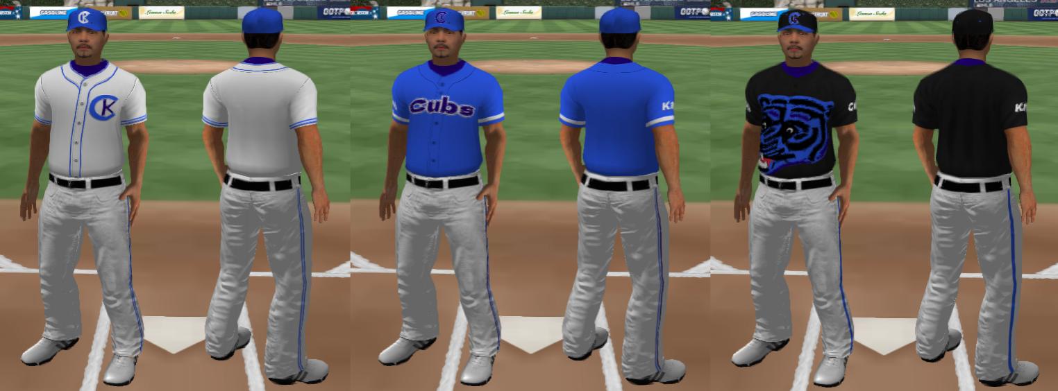
Oh jeez, where do I even begin. Just like how the [REDACTED] doesn't match the Detroit Tigers' look, I had to stray from the Chicago Cubs vibe with a few key adjustments. Note also that the team plays in Nishinomiya, not Osaka proper, and thus tries to represent the entire Kansai area (Osaka, Kyoto, and Kobe).
The main logo is a recoloured Boston Bruins alternate logo. Cap/small logo is Toronto Subway by Quadrat, a font I purchased years ago and have made good use of since. Jersey font and patches are in Dela Gothic One.

Three uniforms in this pack:
- home white with a left chest logo
- road blues with team name on front, geography on the sleeve
- and a black alternate jersey in homage/mockery of the [REDACTED]'s hideous summer jerseys