Quote:
Originally Posted by BigRed75

I agree that the P is very reminicent of the Beavers. And honestly, I can't see them using anything other than an Old English A on their cap no matter where they call home. It's all they've ever used.
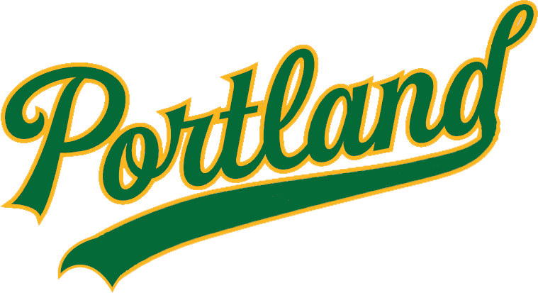
My main problem with the Portland script is the d at the end. The swash at the bottom doesn't link up, and the swash at the top looks completely out of place and cheesy. It needs to look like the d on the current Oakland road jerseys, IMO
Hope you don't mind me channelling my inner CCSLC commenter there. Those folks pull no punches when it comes to C+C!
|
I didn't mind that swoosh on the top, and on looking closely at the real road script, I don't like that weird extra loop they put on top of the d. When I took off the tail, a small loop was left sort of like the real script, and the swash at the bottom looks much better with the notch in it. I'll fix the road jersey with green script above, but I'll leave the gold ones alone since anyone using them isn't going to be super concerned with accuracy in the first place.
Here's the wordmark if anyone wants it someday...