Quote:
Originally Posted by knuckler

I can change the colors on this one if you would like - or anything else for that matter. I used a different ball than the Texas Giants logo and decided to use a buffalo as it is so iconic in Kansas. I originally tried it with the state outline, but Kansas is so rectangular that it didn't look that good in my opinion.
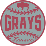 |
I love the ball and buffalo symbol as I agree that it really works for the state. But the colors seem a little off on this one and I can't put my finger on it. Maybe it's that "red" color; I think maybe it looks/feels like a more "modern" color?
Do you think the logo and words would look better in blue? Or maybe a different gray? Or both?