Quote:
Originally Posted by knuckler

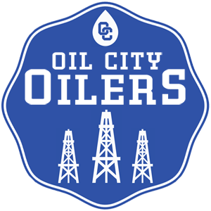
Here is one take on the Oil City Oilers. Please let me know if you would like to see any changes.
 |
Wow! You are very talented. I love how you took elements from the shield like the 3 oil derricks and the OC initials but made it more baseball(only word I could think of, lol). I am also very grateful you didn't use the derrick logo from the houston oilers helmet. That logo is overused imo. After testing it out in the game, I think it would look better a tad darker. I'm thinking 003668.