Baseball talent is distributed on a Bell Curve, but not in the way some here are thinking.
The Bell Curve that applies to baseball (and anything else, if you think about it) encompasses the baseball potential of
every adult man in the world, not just of self-selecting Major League players. The sigmas at far left end of the Bell Curve encompass the physically infirm, the elderly, the athletically disinclined, and the like, who can't play at all. The middle left, middle, and middle right sigmas encompass those athletic enough to be able to engage in the sport at some level, ranging from being able to step onto a (likely softball) field and play terribly, to playing well hardball well enough to be a very good player on an amateur level. And the sigmas at the far right end of the Bell Curve encompass those good enough to play baseball at the professional level somewhere in the world.
The far right hand sigmas (probably the sixth sigmas and higher) represent the most exceptional baseball players from the entire world of adult men as potential baseball players, and the farther along you go along that continuum, the more exceptional they are, and the fewer of them there are.
Here's another way to look at it: through 2013, there were 9,660 non-pitcher players in the history of major league baseball. Here's a table showing the number of players broken out by their career hitting Wins Above Replacement, shown as the integer root of the WAR (WAR Int):

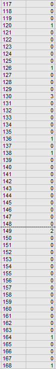
A total of 4,872 of these players, or a little over 50% of them, ended up with career hitting WAR of 0 or less (meaning negative hitting WAR). Another 1,353 of them (15%) ended up with career hitting WAR of between 0 and 0.9. Four hundred and eight-five ended up between 1.0 and 1.9. And so on, and as you go up in WAR, there are fewer and fewer players who were good enough to achieve that.
Here is what this looks like on a chart:

As we can see, this looks nothing like a Bell Curve. For it to look like a Bell Curve, 16% of players would have had to end up with WARs between 0 and 56, 68% with WARs between 56 and 112, and the other 16% with WARs between 112 and 168. We don't see that. We see a huge and dramatic dropoff to almost nothing by the time we get to a WAR of 50, and that's because 98.12% of all major league hitters in the history of the game have career WARs under 50.
So, if anything, The Wolf's chart, if it was meant to represent the portion of the Curve comprised of athletes who could make the major leagues, is wildly optimistic. A real representation might yield a blue area that couldn't be detected with the naked eye.
So, in short, The real baseball Bell Curve takes in the baseball potential of every adult male in the entire world, and since only the very end of the curve encompasses major league hitters, there's no way that part could ever be a Bell Curve. If anything, that part is a cliff.